It almost convinces you that Twitter is more than just a toy.
Naaaah.
Check out Twistori, a brilliant Twitter-fueled demonstration of current social zeitgeist. Perhaps this Comcast customer service person should just troll the site’s I Hate feed for mentions of his employer.
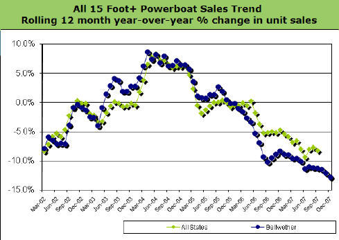
Let’s say you’re a company that mines data in a quiet niche — one not known for analytic vigor. You’ve been doing it for years and do it wonderfully. For clients who appreciate your chops, you’re a godsend. But these clients are exceptional in the traditional retail business sector you serve.
How, how do you spread the word about your super-segmented lists and dead-on business intelligence services? Intuition says you find something to “go viral” around. But that requires some degree of topical relevance, if not outright sensationalism. How do you enliven something as dry as, say, boat purchase behavior (pun intended), to give it the life necessary to grab headlines?
The answer is what Info-Link does. They periodically publish one of the more pedestrian metrics they track: Quarterly sales in bellwether states. Below is their latest Bellwether Report, available on their site and distributed via a simple but effective opt-in email:
You can explore various sales statistics by quarter (use the pull-down). Yes, the news is depressing. But it’s undeniably informative. And share-able. What information can your business repackage in such a way that people will want to share it?
Musical genius Tom Waits once quipped, “Everybody I like is either dead or not feeling well.” This week I took comfort in these words as I was in the throes of a terrible cold. Everyone I knew, it seemed, was either sick or succumbing. As often happens, this got me wondering how widespread the virus really was.
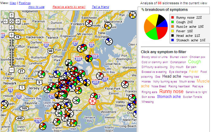
In the past I’ve been frustrated. Maps of everyday pandemics aren’t easily come by. But today I got an emailed link to an interesting new Google mash-up. The link was sent to me by friend and lighting designer extraordinaire Noele Stollmack (who has been begging me to mention her in my blog for months*). A bit of an amateur epidemiologist herself, she confessed in her email that WhoIsSick.org is the “first social networking site that has piqued my interest.”
Noele is actually jumping the gun a bit. It may become a social network someday, but for now it’s a promising database / mapping application showing the spread and concentration of collections of symptoms. Participation is still quite low, but I like the concept. The image at the right shows a tag cloud of the symptoms reported in the Manhattan area. If you click on the image you’ll get an expanded view that shows the NYC Google Map with the distribution of these symptoms.
How are you feeling? If the answer is not well, go to WhoIsSick and type in your ZIP code. You’ll see who else is sick in your area, and have a chance to add your malady to the mix.
Try it. It might make you feel a little better.
*Actually, Noele Stollmack finds blogs “too personal and self-indulgent” to waste her time with, which is reason enough for me to create this Google bomb that ranks high when anyone searches on the phrase noele stollmack. 🙂 Back atcha, Noele!
It was actually Charles Dudley Warner — and not Mark Twain as is commonly thought — who first quipped, “Everybody complains about the weather, but nobody does anything about it.” Boring slideshow presentations come in a close second behind the weather for producing the most heat for the least real flame.
On the other hand, the inventors of Pecha Kucha tell the press that they have no goal more lofty than putting butts in seats at their Tokyo performance space. But I really think they’re onto something.
[youtube C_5l6hXwzUo]
As I mentioned a few days ago, I presented my first Pecha Kucha on Saturday, to support the discussion of a new web metric called the Content Interest Index. Today you can find it posted on YouTube (embedded above), to make viewing and sharing a little easier.
I hope to soon attend my first Pecha Kucha performance event in Chicago (the date is TBD), where I know the quality of the presentations will make me glad I didn’t quit my day job. But until I see what a real Pecha Kucha can do, I’m fairly happy with this quirky way to explore an otherwise “bland” topic. I’m also glad to do my part in “doing something” about the scourge that is SDD (Slideshow Deficit Disorder).
Earlier today I spoke at a conference for web marketing professionals in Jacksonville, Florida. My topic was web analytics. It was a well-timed opportunity for me. I used the talk to do these two things:
Try out a form of condensed slideshow presentation called Pecha Kucha
As I described in a prior post on Pecha Kucha, this is to slideshows what the haiku is to poetry, and Dogma 95 is to film making. It has strict rules designed to bring out the soul of a presentation — especially if you subscribe to the phrase “the soul of brevity.” The rules are that you have exactly 20 slides, and each is up for exactly 20 seconds. That means after 6 minutes and 40 seconds, you come to a full stop.
For those of you as nutty about films as I am, you know that Dogma 95 was borne out of the desire of a handful of directors to treat their audiences like grown-ups. Pecha Kucha may not pretend to be anything loftier than playful fun, but it does respect the audience’s valuable time. How refreshing!
My presentation needed a “hook.” I chose a doozie. I compared a web site’s conversion funnels to the lairs that are built by antlions. These critters were an obsession of mine when I was 10 years old (I even kept one as a pet, in a sand-filled coffee can in my bedroom!).
I frankly could not resist using graphics of the antlion’s traps as ways to illustrate aspects of measuring web conversion. In this elaborate comparison, ants unwittingly encircle the antlion’s lair and some tumble to their doom, in the same way that web visitors cruising around a site’s pages are attracted to offers (the “mouths” of conversion funnels).
Hey, no one ever said marketing was pretty.
Yes, this comparison is a bit of a stretch — if not downright grisly — but I do believe I got my point across. Especially with the help of a supplemental presentation, given in mind map format (here is the map, in Acrobat format … watch out, it’s a quite large file at 2,310 KB). My presentation included excerpts from the CII case study that you can download from this blog entry.
Let me know what you think, and more importantly, if you think the antlion should be some sort of Web 3.0 mascot. What’s the reasoning behind that suggestion? None whatsoever, except the antlion is a very clever creature.
And hey! What the heck. A creature looking this monstrous really needs a break.