Powerpoint to the people: A revolution in presentations

On the last day before a holiday weekend, I thought I’d talk about something that’s important for us marketers but also fun. Or at least it should be. The topic of improving slideshow presentations has been covered wonderfully in the past, but there are some great new perspectives you should be checking out, to keep your Powerpoint decks in check.

(With so many co-workers starting the holiday early today, one of the stalwart few who will be with me in the office today joked that he’d bring Mimosas. From that last riff you’d think he’d followed through on the threat!)

Merlin Mann of 43 Folders gave a wonderful presentation to Google recently on better use of email. His 50 minute presentation (the video is below, and here’s a podcast of the talk) was as fun as it was practical. In response to inquiries, he shared his Powerpoint tips in a recent post. Although I should mention that he is the second person this week to let me know that Keynote has it over Powerpoint, if only because you can look at your speaking notes on your computer’s monitor while the audience sees the projected slide.

In his tips on better slideshows, Merlin mentions Guy Kawasaki’s 10-20-30 Rule: “A PowerPoint presentation should have ten slides, last no more than twenty minutes, and contain no font smaller than thirty points.” This reminded me of another slideshow presentation form (I say form, just as poetry has its classic sonnet and haiku forms). I’m thinking of the form called pecha kucha.

Pecha kucha was invented four years ago in Tokyo by Astrid Klein and Mark Dytham of Klein Dytham Architecture. They created it as a way to attract people to an event space they’d set up. They wanted a freeform presentation environment that wasn’t hackneyed. Sort of an un-poetry slam.

Here are the rules for a Pecha Kucha night: A number of presenters (usually 14) each does a slideshow of exactly 20 images, each lasting exactly 20 seconds. That puts the total runtime at 6 minutes, 40 seconds. The topics of the presentation vary widely, but the presenters are primarily artists and designers. These events have spread, to take place in major cities around the world. I’m tempted to attend the next one in Chicago, in late September.

According to an uncited entry in Wikipedia, this 20 slides, 20 seconds each form has been adopted in some corners of the business world. It allows for a brief, disciplined presentation of ideas, with questions withheld until the end and no room for meandering on the part of the speaker. It’s all in the service of avoiding “death by Powerpoint.” Those who know me well are aware that I dislike using Powerpoint, and try whenever possible to present with a simple MindManager mind map. Or just write out my ideas into a Word document (there, Microsoft, at least you get some of my loyalty!) and speak without visuals. It’s all in the worship of one of my business heros: Edward Tufte.

For my friends reading this in the U.S., have a wonderful Labor Day Weekend, devoid of Powerpoint — unless you like that kind of thing!
Networks are personalizing our sense of place after depersonalizing time

There was yet another piece in the New York Times last week about the disintermediation of established businesses as a result of our new, networked world. In this case, it was about how new map mash-ups are growing in popularity, to the chagrin of many professional cartographers. Here’s an excerpt:

With the help of simple tools introduced by Internet companies recently, millions of people are trying their hand at cartography, drawing on digital maps and annotating them with text, images, sound and videos.

In the process, they are reshaping the world of map-making and collectively creating a new kind of atlas that is likely to be both richer and messier than any other.

They are also turning the Web into a medium where maps will play a more central role in how information is organized and found.

Initially, I thought this article was further proof that networks automatically disintermediate. It’s just their nature. They cut out that faceless “middleman,” whether this “man” is a travel agent, a realtor, or — in the case of Wikipedia — a traditional encyclopedia editor. But then I heard a story that showed me how networks can cut both ways.

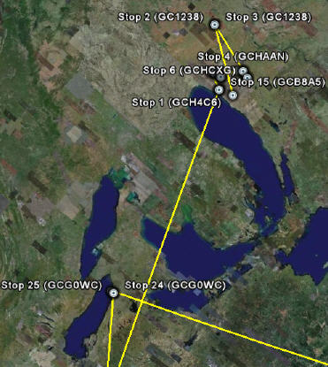
This shows a the path through the Midwest of a TravelBug (think Geocaching)

But first, a word about how place, as defined as our physical world, has always been subjective — that mash-ups are simply expressing this reality in another demonstration of The Long Tail. The above example from Google Earth is the path that a friend’s Travel Bug (lovingly named Tatoo Bug) took as it passed through Midwestern geocaches. This portion was the first leg in a worldwide, 15,951-mile trip that he and other enthusiasts continue to follow on the dedicated Geocaching site.

Just as blogging has shown what happens when you remove the high cost of entry to publishing, these new rich, personalized maps are what you get when you hand mapping tools to the masses. Think about what maps have been in recent history. And I define recent history as the time since researching and printing maps was only available to the chosen few.

When I was a child, living in the hinterlands of the Upper Peninsula of Michigan (also known at “The U.P.”), I was surrounded by towns that were too small for most maps to even acknowledge.

To cartographers, they didn’t exist. The commercial effects were devastating. 

Smack in the middle of a breathtakingly beautiful part of the country, with much to offer visitors, these tiny hamlets withered on the vine because tourists drove right past. These towns were achingly close to the tourist dollars they needed to survive. In some cases they were separated from major U.P. roads by nothing more than a stand of pine trees. So close and yet so far away.

That is all changing.

I’m a rock climbing enthusiast. The last time I climbed at Devil’s Lake, a spectacular set of quartzite climbing faces, I and my fellow climbers found the right place to set our gear based on an old, dog-eared book. The book was far from current, but it was the best we had. I’m expecting, within the year, to make my selection based on one or more Google Map mash-ups, enhanced with Flickr.com photos and user-generated raves, rants and warnings. My guide book will stay on the shelf, more a relic than reference.

And who knows? Maybe, armed with more personal — and personalized — knowledge of the area around Devil’s Lake, I’ll discover an ideal place to eat. One that I didn’t even know existed. A new perspective will reveal a physical world I didn’t realize was right there all the time.

Networks Can Intermediate Too

Is it inevitable that a networked world eliminates the middleman, shifting from an objective, imposed experience to a more subjective one? I thought so.

But on the same day that I read that Times article, I heard a wonderful NPR podcast. It was one of a series of programs called RadioLab, and this episode was about time. The program reminded me that there was an era in this county when small communities like my hometown had a very personal — and personalized — view of time. Up until about 200 years ago, these places had no official “time.” Noon was simply when the sun was directly overhead. You set your watch to that moment, and that was good enough.

Back then you could walk into a room and ask for the time, and get as many different answers as there were people answering. Some would even, quite sincerely, answer with something like “It’s nearly time for me to harvest the corn.” Because what was time, after all, but something you experienced subjectively?

One day that all changed, and everyone followed the same timeclock.

And the intermediary that created this change? None other than a network: The railroad.

With much at stake for both the train and the towns along its path, someone had to agree to exactly when the 12:07 train would pull up to the stop. The network wiped away all personal “maps” of time and replaced them with one that was objective and unyielding.

All of this is a reminder to me that two of the most agree-upon truths — Time and Space — which keep us moored to this harbor called Reality, are more open to interpretation that we would care to admit.

We all know that retail’s mantra and battle cry is Location, Location, Location. But the spread of map mash-ups helps us realize that what makes a location good is in the eye of the beholder. Take it from me: If what you want is a really good smelt fry, I know a place in Rapid River, Michigan that is worth seeking out.

If there is ever a Web 3.0 Mount Rushmore, Blaise Aguera y Arcas’ face will be next to Jeff Han’s

Let there be no doubt. The past year has given us a clear glimpse of Web 3.0 and how we will experience it. First Jefferson Han gave us the multi-touch interface to this new multi-dimensional world. Now Blaise Aguera y Arcas gives us the information architecture behind that glass rectangle. Blaise Aguera y Arcas is an architect at Microsoft Live Labs, and in this breathtaking video he shows what Ethan Zuckerman called, after this TED2007 (technology, entertainment, design) presentation, “Perhaps the most amazing demo I’ve seen this year.” You be the judge.

A demo of Photosynth

Thinking in mapped networks, with connections real and implied

More than a year ago I started telling trusted friends and colleagues about a great piece of software. Half-joking, I would lean forward and confide that this is one secret too valuable for me to blog about. The digital equivalent of a performance-enhancing drug, it was something I’d prefer not to leak to competitors. That is, until today. In the spirit of openness, and timed to coincide with my friend Kevin Hillstrom’s One Positive Day campaign for blogging civility, I am ready to spill the beans.

Thinking With Both Sides of the Brain

Ever since my college days I had wondered if there was a smarter way to organize my thoughts. Common note-taking techniques didn’t seem to cut it. Looking around, I wasn’t optimistic. Certainly the first personal computers, with their DOS-like lists, hierarchies and sequences, were of no help.

Then I found the books of British “pop psychology” author Tony Buzan. In a Madison, Wisconsin used bookstore, I discovered the first: a copy of his 1974 Use Both Sides of Your Brain, where he talked about something called mind mapping.

Buzan wrote that standard outlines require scanning from left-to-right, top-to-bottom. This causes the brain to work harder to make the interconnections between concepts.

Back then Buzan couldn’t have envisioned the modern solution to this dilemma, which is to boil lists down to a point where they lose much of their potential meaning and utility. Or conversely, the author will stretch out the information across a blinding sheaf of slides and spray of “bullets.”

I’m referring to Powerpoint of course, a product that Edward Tufte, author of The Visual Display of Quantitative Information and other classics, so eloquently lambastes in this essay.

Our brains are built to survey information as it is seen in the physical world, making associations through placement, space, distance and color. The more complex the subject, the greater our brain resists tidy categorizations and rankings.

Thinking In Mapped Networks

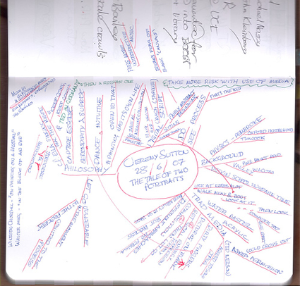
Enter the mind map. The illustration below shows a hand-drawn example. It’s one Buzan that would have been proud to call his own.

An example of a hand-drawn mind map

To the person who drew it, there is more meaning here than could be crammed into a dozen pages of lists.You can instinctively see how these maps help with lateral associations while still allowing for more formal hierarchies and sequences. As you might expect, some maps are never really completed by their owners. They are continually refined. New insights and perspectives leap off the page with every rereading. This is a good thing, because it shows how concepts can grow and deepen over time.

That was Buzan’s point, and luckily, many modern software developers have listened.

An advantage of the computer-based mind mapping tools is they are easier to share with others (you can even port some softwares’ output to other programs, including … Powerpoint!). Annotation features also help. They add explanation that is needed when you’re showing your map to others — or just trying to remember what the heck you meant when you drew it!

The best mapping tools can even be used as collaborative brainstorming aids. I’ve checked out several over the years, and the best by far is the award-winning Mind Manager. Visit MindJet.com to see for yourself.

Put bluntly, it could change the way you think.