Smart business decisions come from simplifying problems. Bars can help!

Solving complex business problems “ain’t always rocket surgery,” to cite a colloquialism I just discovered. It often boils down to a little bar and a big bar.

As an outsider, I have the luxury of both working with data scientists and in gentle opposition. The first part is easy. Data scientists work with my clients’ data daily, and have produced elaborate models to help make things more understandable.

But I also work in gentle opposition. To quote best-selling author and distinguished professor of economics (and fellow “outsider”) Steve Levitt, it’s all in the incentives. He’s excerpted immediately below from one of his People I (Mostly) Admire podcast episodes. You can listen to this one-minute audio clip by clicking the player, or read on … the transcript immediately follows it.

Little Bar / Big Bar

When I work with firms that have data scientists, what I find almost uniformly is that they operate in an incredibly complex space. They’re very concerned with technicalities, with techniques, with things being hard. And I think the answers are often very simple. So I try to always do simple things, and try to relate them in very basic ways. Like, my favorite kind of graphs are Big Bar / Little Bars graphs.

They’re graphs that have one really little bar … and one really big bar, and those are the kind of graphs that I show to CEOs if I’m trying to convince them of something. And the CEOs say to me, ‘Wow, that makes sense to me. I don’t understand how you take the same data that my data science team has and I never understand anything they’re saying.’

So, you might say ‘The answer is to do things really simply,’ but I think it’s more complicated when you think of incentives. Because much of the power that comes to data scientists in firms and organizations is because they are completely and totally inscrutable. And the other people have no idea what they’re doing. And by having a set of skills that no one else has, you can wield power because no one understands why you’re doing it. You have a very special talent. And so, I have the luxury of being an outsider.

Steve Levitt, “I’m Not as Childlike as I’d Like to Be” | People I Mostly Admire Bonus Episode

Wow! Can I relate. I hear this frustration when I talk to the leadership within my clients. Which is why I have espoused simplicity in everything I report, and have for years.

Of Oracles and Job Security

At the end of a talk I gave in 2018 about experience optimization, I urged the audience to think of themselves as modern day oracles. But instead of the literal magic tricks that the Greek vestal virgins employed to keep their jobs, we only have our science to keep us regarded as useful and legitimate.

Scrupulous science.

Many data scientists stop there. They generate reports using the latest and greatest methods, but when the output is shared, business leaders too often have no clue what the data is telling them.

That quote I shared with you from Steve Levitt was in response to a question about the future of data science as a profession. If you are a data scientist, consider this advice: Spend more time listening to your employer about the problems dogging them. And if you’re one of those employers, you cannot go wrong by hiring, when appropriate, someone outside of the data scientist industrial complex to whip up the bars!

Make your charts more like maps

Pecha Kucha is Japanese for “chit-chat.” I’ve talked about the presentation style on my personal blog.

In a Pecha Kucha, the speaker is restricted to just 20 slides, and only 20 seconds per slide. It’s a 6 minute, 40 second burst of information. As for the one embedded below, here’s some context: Think of the various maps in your life. Mine come to mind easily. I see one every time I go home.

I have a map of the world on the wall of my apartment, with pins showing places I’ve visited and others for where I’d like to visit next, once this Covid nightmare ends. As you can imagine, it drives decisions and actions.

Another map is one we all have. It’s the small map in our phones, powered by GPS. That map drives decisions and actions every day.

But if you’re responsible for helping your bosses or clients understand data, what about those data dashboards or charts easily leads them to take action? In my experience, truly actionable charts are few and far between!

All too often our charts do not drive action

Why is that? In this Pecha Kucha, I explore that question, and show you how you can drive more consensus and action with your data visualizations by choosing and customizing charts to be more map-like. I pull two examples from my decades of experience as a marketing analytics consultant.

The data is all made up, but reflects real life business challenges, and how making your charts more like maps can help to bring your bosses or clients to decisions. And isn’t that what data-driven decision making is all about?

Enjoy.

How to lie with data visualizations, Part 1

The last time our world experienced a virus of Covid-19 lethality, our public discourse was not that different than today’s. Of course I’m talking about the 1918 Spanish Flu. Even its name is a lie. It was called that in U.S. newspapers not because Spain was the origin of the virus but because Spain was a neutral party in World War I, which was blazing at the time.

How’s that, you say? While other countries embroiled in the conflict didn’t want to spook their citizens back home by honestly assessing the toll the deadly flu was taking on their troops, Spain was more forthright. More than most countries, Spain even took precautions such as strict quarantining and social distancing.

Following the dictum that no good deed goes unpunished, Spain got to “own” the flu appellation in the U.S. press because of those actions, in a xenophobic slight not unlike the way French fries — as beloved during the time of our multi-country occupation of Iraq as they are today — became known for a time as “freedom fries.” Why? France did not choose to join our little alliance. And we all know how successful that nation-building adventure was.

It makes you wonder when we will start paying attention to what our European neighbors are thinking. They occasionally may be onto something.

Hey, we’ve got this!

So what has this got to do with data visualizations? Just that powerful systems often try to deceive as a way to hold onto power. This can involve the systems disclosing data they possess to their constituents in a way that assures the inattentive Hey, we’ve got this! I’m going to show you an example from my recent work, but first, let me show you the data visualization pants-on-fire deception that got me typing in my basement instead of enjoying this sunny Saturday afternoon ..

This is a set of charts — one from July 2, and the other from today, July 18. In those two weeks, can you spot the 50% increase in cases per thousand? (I verified today’s number on the Georgia Department of Health website just now, and confirmed the July 2 screencap is legit as well).

Made more infuriating when you realize human lives are at stake, the graphic is right below this statement: “The charts below presents [sic] the number of newly confirmed COVID-19 cases over time. This chart is meant to aid understanding whether the outbreak is growing, leveling off, or declining and can help to guide the COVID-19 response.”

Okay, quiz time: Can you spot the increase in this before-and-after map?

Map before

If you haven’t caught it yet, I’ll give you the explanation that @andishehnouraee provided: “[Georgia Governor Brian] Kemp’s health department keeps changing the numbers on the map’s color legend to keep counties from getting darker blue or red. 2,961 cases was Red on July 2. Now a county needs 3,769 cases to show red. The result: an infographic that hides data instead of showing it.”

I find this indefensible. I will say other graphics on the same page definitely show a spike. But if I’m a Georgian and I look for my county on the only map on the page, how am I to know that my community has half again more confirmed cases than it did two weeks ago? This data visualization “shell game” may persuade inattentive citizens of a given county to not social distance, or wear a mask in public, and thereby cause further infection in an actual, honest-to-goodness public health crisis.

[Some Redditors have said these maps were designed to show county-to-county differences, but I’m not buying it. When you choose a color scale, either keep the numbers the same for the colors or don’t use numbers at all, and show percentages. The typical citizen isn’t going to spend more than a few seconds looking at the map, and will get the wrong story from this one.]

How to deceive using shifting scales, with Excel as your accomplice!

The above is an example of: If you don’t like the data, change the base numbers. Another, more common way is to not clearly show your bar charts or line charts starting from zero where the axes meet. Let’s say I am trying to improve my abysmal running pace, and share my progress with the world (These are real numbers, but give me a break … I’m an old nerd, not an elite runner!):

Look at this glorious chart! I can hear you exclaiming: What progress you’ve made, Jeff! But is it really that impressive? Of course not! When I popped these numbers into Excel and hit Insert Bar Chart, Excel did some editorializing. It started my Y-axis at 9.8 minutes per mile. And in doing so, it made me look like to the inattentive as though I’ve halved my time since March!

Let me repeat: Excel did this handicapping of my pathetic times automatically.

To get a real world view of my running — a world which includes rare athletes who have completed  marathons at far less than half my personal best — here is the same graphic when the bars start at zero minutes per mile:

Not nearly the ego-boost, but it’s honest!

Scale breaks to the rescue

What if you just don’t have the room for all of that athletic plodding? In other words, what if my sad pace just wouldn’t fit on the slide, the bars being too tall? Yes, that’s a real thing, as I’ve pointed out in data visualization lectures:

Sometimes you want to take your audience all the way to the treetops, where the trunks are invisible but you can see which are the tallest of the majestic redwoods.

There’s this thing called a scale break  (shown below with a made-up data set):

Now you can see a chart that tells an honest story without messing up the scale of your slide. And you can focus your audience’s attention on the data that matters.

Watch this blog for a follow-up, with more tips on how to lie with data visualizations!

Visualizing bounce rates using brownie charts

Today on Jason Fall’s Social Media Explorer, I discuss my new favorite data visualization technique — one that I’m starting to move into production with web analytics reports I create for clients. Its official name is the Tree Map, but as I mention in that post, I prefer to call it The Brownie Chart.

That post has an example of how I use brownie charts to show a promising new web metric, the content interest index (CII). My example on the site uses a made-up business, Everything Brownies, with a web address of EB.com.

Note: Yes, I know. That web address resolves to a real encyclopedia site. The reason I didn’t just make up a domain name is you never know when one will go live with a site. I didn’t want to have someone inform me, two months from now, that my blog is now pointing to a porn or gambling site! Unless Encyclopedia Britannica takes a surprisingly sleazy turn, I think I’m safe.

Here is another example of how the tree map / brownie chart can make web analytics reporting easier to understand:

Charting Bounce Rates: “I came, I saw, I puked.”

I agree with Avinash Kaushik that bounce rates are a helpful way to measure how well you’re connecting with site visitors. Actually, he’s a little more enthusiastic than I am, with blog post titles such as this model of understatement: Bounce Rate: The Sexiest Metric Ever? Three years ago, on his own blog, Avinash described bounce rates this way:

So what is this mysterious metric? In a nutshell bounce rate measures the percentage of people who come to your website and leave “instantly.”

They’re the one-page visitors. Yes, they might be finding what they were looking for — but more often than not, these people just didn’t dig the neighborhood.

Avinash has refined his description over time. In his recent, truly outstanding book on measuring web traffic, Web Analytics 2.0, he characterizes bounce rates this way: “I came, I saw, I puked.”

Bounces can be reviewed for all traffic to a site, or only for certain important segments — traffic from search engines is a good example. Reporting of bounce rates can also be broken down by page.

The brownie chart becomes particularly handy for this per-page bounce rate reporting. It helps those responsible assess the severity of a site’s problem pages.

You see, you can’t easily be sure that a page with a high bounce rate really is a problem page. Think of it: If nearly everyone ups and leaves when they arrive at a particular page, but that page gets relatively little traffic, there’s no huge emergency. Content management resources are usually scarce, so it’s better to keep looking, for other pages that attract more page views that happen to have comparatively high bounce rates. It’s those more popular pages that require immediate first aid!

To illustrate, take a look at Everything Brownies’ bounce rates on this brownie chart. The graphic shows all major pages of this fictitious site, and shows the pages as more red if they have the highest bounce rates relative to the others. You should know that size represents the relative numbers of page views. The bigger the “brownie piece,” the more views that page gets.

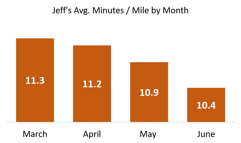
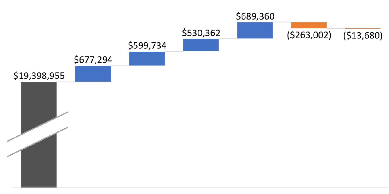
What does this chart tell us? Quite a bit.
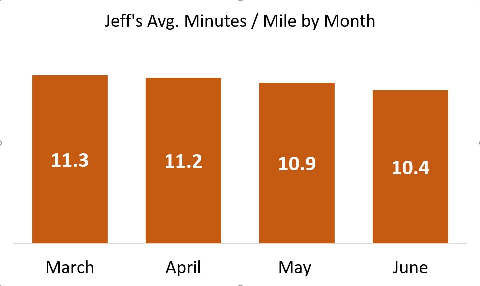
The Holiday Brownie Baking Kit, which I placed my mouse over in this screen capture, has an excellent (i.e., low) bounce rate. It also has a ton of page views.

That means this page is doing quite well in keeping visitors from leaving immediately. Well done! On the other hand, Deluxe Baking Pan is not nearly as successful. Its relative bounce rate is quite high, and because it has the most page views of the entire site, it’s clear this page is majorly dropping the ball!

There are plenty more insights, but you get the picture.

As I mentioned on Jason’s blog, what I like about this charting format is non-math types (such as myself!) can understand these statistics immediately, and know exactly what needs to be investigated further — and in what order of priority. As my friend Bob likes to say, “That’s good stuff!”

I hope you find the potential of this charting technique as exciting at I do.

A Round of Applause for BeGraphic and Sparklines for Excel

This example of a fake report for EB.com, as well as the one on Social Media Explorer, was produced using an “Add-on” for Excel called BeGraphic. The Add-on consists of a whole suite of graphic tools — all based on Excel data and rendered within that application. The particular functions I used were part of Sparklines for Excel within the BeGraphic suite. I urge you to support the folks behind these amazing visualization tools.

Overcoming the treachery of analytics

What do these three quotes have in common?

  • “Worship no false idols” — The First Commandment in the Old Testament
  • “If you meet the Buddha on the road, kill him” — Zen adage
  • “Become a ruthless killing machine when it comes to metrics/data” — Avinash Kaushik in a recent blog post.

If you guessed that they all warn (with increasing violence!) against mistaking the symbol of something for the real thing, congratulations! You won a pipe. Surrealist painter René Magritte painted this particular pipe as a way to get us thinking about the paradox of symbols. Under it he painted a caption, “This is not a pipe.”

To drive his point home, Magritte named the painting, The Treachery of Images.

So how can we know when it’s time to wage war against our own treacherous web analytics? And once the body count has been tallied, what takes their place? What do we use to answer key questions and spur appropriate actions?

Results Simply Summarized

The answer: Show your audience only what they really want to know — not mere numbers and measurements, but the other RSS: results simply summarized. Here’s Avinash’s post for the full story.

And here it is in a nutshell:

He describes a favorite application he downloaded for his Nexus One phone. It’s a cardio trainer. The app starts out just like another popular body monitoring system. I’m thinking of the Nike Plus application for the iPhone. Both give the standard run-down of miles run and progress achieved, compared with past sessions.

The cardio trainer app then makes an elegant attempt at RSS. Avinash, for one, feels that it succeeds. I agree. It refocuses attention past the numbers to the actual workout goal.

At the end of each run, to reflect his level of exertion, Avinash is presented with an award of sorts. The screen shows two pieces of fruit — two pairs. They represent the number of calories burned. The pairs are his to enjoy guilt-free. (Or he can imagine a calorie-laden equivalent, in a mental swap of one food for another. Perhaps the next version of the app will allow users to actually do this; To replace the outline of two pears with a rendering of a candy bar, or a couple of bottles of beer!)

You might think these graphics are the same as Magritte’s pipe — mere symbols; not the real thing. You’d be overlooking a major distinction.

All Magritte was doing was showing the pipe. Avinash’s workout app was presenting the pears — awarding them. It was the summarization of the data behind it, proving to Avinash that this was his hard-won snack. It says, “Here you go. You earned it.”

Connecting On Two Levels

The representation of the pears became something he could connect with — both rationally and emotionally. Unlike Magritte’s pipe, the pears are results, supported by evidence. Consequently, for the recipient, they become so real that person could almost taste them!

Sadly, if most analytics pros were asked to cut out their own distracting and unpersuasive metrics, little would be left. Most metrics talk and talk but never get to the point.

This is precisely what senior management does not want. They want quick and truthful take-aways. Will they be dining on one delicious pear this month, or two? Or will there be none at all?

Of course business leaders wouldn’t want to see pears in their analytics. That would be absurd. So what do they care about? They want to see money of course. Or at least, clear proxies for money. Showing images of people is always good, since selling things to people is the surest path to making money. With that in mind, consider using generic silhouettes of them, shown judiciously, and with data that supports their numbers on the page.

Be bold. Show senior management that their site generated more sales leads this month — as represented by silhouettes of cookie-cutter executives (presumably eager to know more about the product). Count them. How many more are there this month compared to last? Line them up for comparison, month-to-month or year-to-date.

Or, as another example, show how the website is lowering operational costs. Illustrate the success of answering more consumer questions online versus having these people call your pricey phone center. In this case, the graphic could be a string of telephone headset icons. Compared to last month, are there fewer of them shown, or more?

Go on your own metrics killing spree, but first, know what you’re pursuing.

Kill any metric that produces more smoke than light. Allow the remaining metrics to build upon each other and add richness to your story. Then, as a satisfying grace note, find that single graphic which best sums up the current situation. Use symbolic language that is meaningful to your audience, to transcend facts and figures.

Do this, and far from being Magritte’s pipe, this graphic will be your own “Avinash’s pears.”