MindJet adds Gantt charting to its mind mapping software

I’ve been an advocate of mind mapping for years, and have recently talked about my preference for using MindJet.com’s mind mapping product, MindManager. I even demonstrated its power, while leading a discussion about rich digital media, at an UnGeeked Conference in May. I find the system a huge time-saver. Now MindJet has upgraded their software to include a valuable way to share project roles, deadlines and milestones: Gantt charting.

Since the 1990s I’ve appreciated the ability of Gantt charts to bring teams to agreement on project roles and deadlines. It’s an equally valuable way to show clients how any delay in supplying crucial content or sign-offs can push web launch dates out. Below is an example:
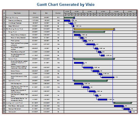
The detail is intentionally too small to make out, because I’ve used live client details. From left to right, this chart shows the task name, and start date, end date, and duration in days. After that is the chart itself. Milestones are the green bars. Every task within that milestone must be completed before the milestone is reached and the next milestone and task set begins.

My web development team would “own” some of the tasks, and the client would own others. At a glance, everyone knew what they needed to do and when. They also knew the effects on the project as a whole if they missed their deadline. Great stuff.

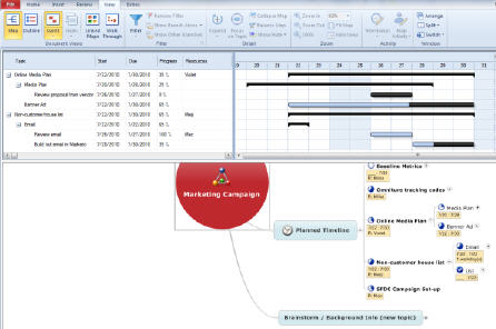
Now, the just-released MindManager 9 includes this feature. Below shows a simple Gantt chart, from MindJet’s introductory video:

Needless to say I’m eager to give the Gantt charting a test spin. What’s especially exciting is it takes the collaborative strengths of building a mind map as a team and fairly quickly converts that shared map into a full-blown project plan.
Dashboard liberation: Excellent Analytics moves Google application to Excel

Although it’s easy to bash Microsoft, over the years a handful to tricks have made me an avid fan of Excel. Pivot tables and relational look-ups (all hail VLOOKUP!) are two arrows in my web analytics quiver. I’ve just added another. If you work in Google Analytics a lot, you should too.

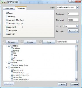
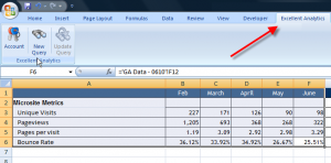
Excellent Analytics is a free Excel add-in that truly lives up to its name. It allows you to run queries to Google Analytics’ API right from Excel, and publish its results there.

Say goodbye to many of the “Save to Excel” hassles that used to come with wishing to share and chart Google Analytics results beyond its powerful-yet-limited dashboard.

Go to Excellent Analytics now and give it a try. You’ll need Windows Vista or greater, Microsoft Office 7, and Windows .NET Framework 4. Give yourself a couple of hours to install and learn the system. Then start publishing, charting and sharing. You’ll fall in love the way I did!

World Cup win was also a triumph for Edward Tufte

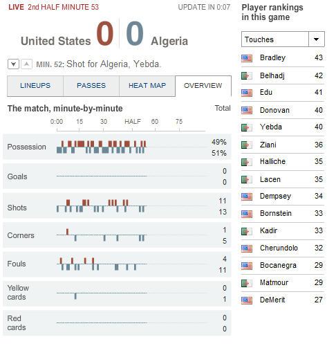
The U.S. just won a pivotal game in the World Cup, and it was a squeaker. I “watched” it while working, using an amazing new data visualization app on the New York Times website. One tab in particular reminded me of the teachings of data visualization guru Edward Tufte. It showed an easy-to-read display of key game statistics, updated every 15 seconds:

The right column had a pull-down that allows users to see vital statistics about each player. The number of touches in the game, by player, is shown above. Others include fouls, cards, and of course goals (a list of exactly zero players at this point in the game!)

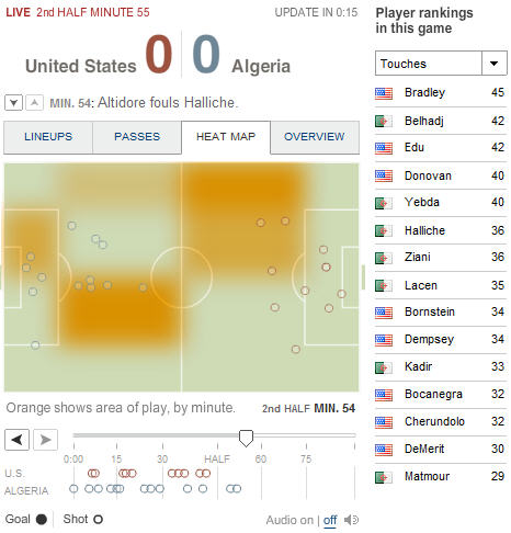
No, I’m not such a data wonk that I could feel like I’ve experienced the action by watching this view. But the other tabs at least gave me a hint at the action I was missing away from the television screen. Check these out, keeping in mind that you can see the latest action, and review the action that took place earlier, in a type of choppy animation, using the timeline player at the bottom of the app:

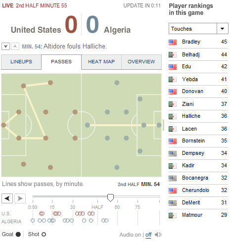
And here’s another:

Notice, at the very bottom of the graphic, the audio toggle. I chose to keep the app in the background, with the audio turned on. Throughout the game, the app was silent (thank goodness it didn’t pipe the vuvuzela noise through my computer speakers!) That is, the app was silent until that U.S. goal in added time. That’s when I heard a three-second burst of cheers. It was a cue for me to check the app and receive the thrilling news.

Edward Tufte believes the future vitality of business — and perhaps even of our species — hinges on how well we can communicate complex information quickly and intuitively. The Times has adopted many of his favorite techniques, particularly in the Finance and Sports sections. For example, those little sparklines you can find there were first made popular by Tufte.

This latest real time tracking of the complex game of world football (a.k.a. soccer) is a demonstration of how far we’ve come with data visualization, and an exciting taste of the future. Gooooaaaaallllll!

Voice: The original rich media

I had a fun time talking to the group this morning at UnGeeked Elite. I spoke about the power of voice asset management. If you’d like to know more, here’s a post recently on our VoiceScreener blog, by our CEO, Kelly Fitzsimmons, describing Voice as an Asset (VaaA).

I promised to post a mind map of the post-presentation discussion. Here it is (click to expand):

Also, if you want to check out that TEC video, here’s my original post about it, Jeff Han’s demonstration of multi-touch screens. I was wrong in that it’s more slanted than vertical, as I had said in the presentation. I had seen another video of him demonstrating the screen somewhere else, and that one was more vertical, and shot more at a distance.

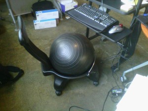
Finally, Jonathan Brewer, (@houseofbrew) of FirstEdge Solutions had dared me to show him that super-comfortable office chair I work on. Here’s the photo I just posted of it on TweetPhoto (click to expand):

Tuesday’s Milwaukee Pecha Kucha Night will blow you away

Twenty slides, twenty seconds, 120 minutes of anarchy.

That’s the promise behind the upcoming Pecha Kucha event, to be held at the Sugar Maple, on the corner of Lincoln and Kinnickinnic in Milwaukee. Judging from the names I recognized among the list of presenters, this PK Night should be the best yet.

No Cover

Yep. It’s free to get in this time. And because it’s held at the Sugar Maple, there will be a huge assortment of microbrew and imported beers.

Pow? Free? Wow

That’s right. The first 20 people through the door receives a copy of Andy Nulman’s Pow!

Milwaukeans Watching a Pecha Kucha Presentation

As Always, Diverse Topics

Watch presentations that last no longer than seven minutes, on the following:

  • Green Homes
  • Coffee’s Global Impact
  • “I Don’t Dance, Don’t Ask Me”
  • Brewing Beer
  • “Novembeards”
  • The Three Brains of Humans

… And much, much more!

Presenters include James Carlson, Jim Chambers, Fred Gillich, Steve Hawthorne, Ryan Matteson, David Ravel, Winston Smith, Mike Brenner, Betty Blexrud-Strigens, and Jim Warchol.

It all starts at 8 PM this Tuesday, February 23, 2010. I’ll be there. Will you?

Pecha Kucha Milwaukee
at The Sugar Maple
441 E. Lincoln Ave.
Milwaukee, WI

As always, check in at the official Pecha Kucha Milwaukee site for updates!

Related posts: