A look through the viewfinder reminds us that technology changes us irreversibly

As I post this, I’m still on vacation in the Faroe Islands, where I’ve attended the wedding of a dear friend’s daughter. It was a traditional ceremony, blending ancient and new traditions. For instance, ancient Faroese and Danish songs were sung during the wedding reception, which also featured PowerPoint slideshows of photos and Quicktime videos depicting the bachelor and bachelorette parties. Digital cameras were everywhere, of course.

I’ve thought for many months how digital technology has changed the way we experience the world. We like to think that we craft our tools to serve us, but the limitations of these tools cannot help but change us as well, in the same way that our human eyes see a different spectrum of light than, say, the puffins I photographed the other day on the steep Faroese cliffs.

One example of this profound change is electricity, which is quite obvious. The other is more subtle, and involves digital photography.

Electric Light: The Other Midnight Sun

Faroese weddings go on for two solid days. The first day, which included what Americans would call the reception, had three distinct meals (the formal dinner, the serving of cakes, and an early-morning soup course). The first meal was only just ending at 11 PM, which didn’t seem so late, since the sun was only just behind the horizon. What’s more, being so close to the Arctic Circle, the sun didn’t stay away for long. As it began to reemerge, at 4 AM, we were still dancing to a band that played exclusively American — and British Invasion — rock songs.

I was told that the wedding dancing of a few hundred years ago would have included a traditional Faroese dance that takes at least an hour to complete (danced, as it is, to a song with 300+ verses). Back then oil lamplight would have illuminted the steps. This certainly would have dampened some of the more boiserous aspects of the event!

So much about us has changed because of technology’s “electric sun.”

In Maury Klein’s The Power Makers: Steam, Electricity, and the Men Who Invented Modern America, I recently read of the pivitol day in September of 1882, when Thomas Edison, the man known as the “Wizard of Menlo Park,” illuminated the first 400 electric lights installed in New York City.

What struck me about his description is the muted reaction of New York Times reporters. Keep in mind that daily news reporting is driven by extremely tight press deadlines. Yet before the electric light, there was much that could be forgiven. A reporter could more easily file stories developed over weeks — and in the process, get more sleep.

Edison’s “lighting of New York” included 27 electric lamps in the Times editorial rooms. And so, you may wonder, what was the account of this sudden conquest over darkness from the reporters of “The Grey Lady?” Well, the column on Page 8 (yes, 8!) of the next day’s paper said it was, “In every way satisfactory.”

Klein made the obvious point that the paper, “never fully grasped its significance.” Only hindsight could show these reporters that their careers were to be changed forever. And also their family life. The electric light would extend both wedding festivities and work responsibilities — allowing for a day that need never fade into darkness.

Life In A Digital Viewfinder

In my travels these two weeks I’ve visited some extraordinary families (and I have one more to meet, in Belgium, before returning to the States). On the walls of homes in Milan, Berlin, Copenhagen — and now Torshavn, Faroe Islands — I’ve admired photos of relatives that sometimes go back to the very first silver plate photographs of the mid-1800’s. These photos are sometimes right next to the latest generation’s photos. Having observed at the same time some very ancient Eurpoean traditions, attitudes and mannerisms, I have to again posit that the medium has changed us as surely as we have changed the medium.

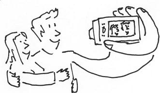
It was two years ago, when I saw this pose depicted in a still from a movie (illustrated below), that I first realized that the portability and disposability of digital camera technology actually created a new type of romantic embrace.

Compare the stock-still (and emotion-free) poses of couples and families in the tintypes of antiquity with this commonplace example of PDA (public display of affection), and you have to wonder if our cameras own us as much as we do them.

The Digital Camera Embrace

Traditional values — superceding romantic love with love of family, and narcissism with selflessness — may have been made quaint as much by our evolving tools as our evolving beliefs.

Am I onto something? Or have I simply been eating too much wedding day halibut salad and whale blubber?

Multi-touch screen tables interact with casino patrons

Since Jeff Han first presented multi-touch screen technology, there has been a great deal of speculation on which industry would be first to make use of it. The industry first to reap profits from another breakthrough technology — personal video players — was not surprising “adult entertainment.” But manipulating images on a cool glass monitor is hardly conducive to this, er, prurient interest. Allow another vice, or maybe two, to step in and fill the void.

Of course! Drinking. And eventually, gambling.

Thank you Mike Luedke, of Dinefly fame, for tipping me off to this extraordinary application of Microsoft Surface technology. As this report explains:

The six rectangular tables with built-in 30-inch flat screens using Microsoft Surface technology were installed in a lounge at the Rio All-Suite Hotel & Casino in Las Vegas, with custom applications built for Harrah’s.

A spokeswoman for Microsoft said the units sold for a base price of $10,000.

A program called Mixologists lets patrons play bartender by creating and ordering concoctions of whatever cocktails and mixers they click on. The system is able to remember users’ drink orders and, one day, may be able to offer customers the same drink at other Harrah’s locations, such as when they play a slot machine.

Another program lets users watch YouTube videos, either by searching or choosing from a list of popular videos. Harrah’s officials said they reached a licensing deal with YouTube on Wednesday.

The table also includes a program called Flirt, which lets customers sitting at any such table in the lounge see and chat with each other, take and e-mail pictures and even trade cell phone numbers.

Okay, so maybe there is a tie-in to prurient interests. Or at least hooking up. Regardless, this is a brilliant application from Harrah’s, a group that has already shown its mastery in customer relationship marketing.

I’ll be curious, when my parents next travel to Vegas, to see if these tables will suck them in. They are long-standing members of Harrah’s Club. I hope they do. I would love to see how data from interactions with these bar tables are used to further improve their experiences at the casinos and beyond.

Speaking of my parents, Have a great Father’s Day weekend, dad!

Your web site should be like the world itself: Inviting and “flat”

When Thomas L. Friedman asserted that The World Is Flat, he was referring to the interconnectedness of this newly networked world. He could have also been referring to the structure of an ideal web site. Why should it be flat? The site needs to offer a way for nearly everyone to efficiently find everything with the fewest possible barriers.

Ryan Singer of 37Signals reminded me of this when he wrote that web architects should think about paths instead of hierarchies. He writes:

My friend did some work for a shoe company who wished to hide six different kinds of shoes behind a gate called “Performance”. When my friend asked 40 uninvolved people in his office what the category “performance” meant to them, only 10 had even a vague idea. So hierarchies have their problems.

My team’s web architects have often run into the same thing when beginning a redesign of a client’s web site. The language used in the architecture often hides what users are striving to find. Ryan’s solution is to, “Collect all the paths you can think of in a pile, pull out the 8 paths that 80% of your visitors come looking for, and that’s your home page. When paths overlap or the same customer needs them, weave them together.”

I’d council to do the following, as a supplement to this excellent advice:

  1. Build your path list, to use Ryan’s term, by scrutinizing many a visitors’ navigation of last resort. Namely, look at behavior in your site’s search function. As I’ve mentioned earlier, mining your internal search data can reveal much about what your web site is hiding from user!
  2. Consider approaching the challenge in terms of audience, and not exclusively in terms of most popular pages (such as the eight paths accounting for “80% of visitors”). The reason? Your visitors may be leaving before they find some of your most popular content.

Finally, I’d add this word of caution — three times, in fact: Test, test test! Your key audience may be of a generation where an indiosynchatic navigation system my more useful, but too initially initimidating. Baby boomers and their elders came from a time when hierarchy was not a dirty word. They may instead have a much shorter word for an elegant but unexpected site navigation: chaos!

Have I missed any other tips in making a site as flat as the digital world where it resides?

Why you’ll never find truly brilliant open source web design

Malcolm Gladwell recently wrote about the nature of invention, and a society’s response to it. We revere scientists as heroes, for inventing solutions to our toughest problems. Yet Gladwell points out that these geniuses seem to be more vessels than virtuosos.

The inspiration for a particular technology seems to arise “in the air,” to be picked up by the right inventive minds and made real. In many cases, such as the story of the invention of the telephone, there is more than one inventor. In addition to Alexander Graham Bell, there seems to be a parallel invention of the device by a fellow by the name of Elisha Gray. Why is he unknown? As often happens, the awarding of bragging rights turns into a race to the patent office.

Science historians call this phenomenon “multiples.”

The same creative insights seem to strike a number of inventors — often scattered across the globe — at the same time in history. Gladwell reminds us that the uncertainly of whom was the real originator makes our inclination to name a device after its “inventor” a dicey proposition at best:

We think we’re pinning medals on heroes. In fact, we’re pinning tails on donkeys.

This made me think of open source applications. Perhaps it’s fitting that we do not commonly know the single inventor of PHP technology — not because so many have built upon this foundation, but because the foundation itself was “in the air,” ready to be interpreted into code. I use PHP as an example, but any open source innovation will do to make my point.

Few would argue with the genius behind PHP. So why don’t we see multiples of web design? Aren’t good designs of sites “in the air” as well?

Singulars versus Multiples

Gladwell provides a hint to an answer when he states, “[a historian’s observation] about scientific geniuses is clearly not true of artistic geniuses.” He goes on as follows:

A work of artistic genius is singular … Shakespeare owned Hamlet because he created him, as none other before or since could. Alexander Graham Bell owned the telephone only because his patent application landed on the examiner’s desk a few hours before Gray’s.

I find this distinction fascinating, because both types of genius are put into play in the creation of a great interactive experience. I love that one part of the process — the technology — uses the work of many to channel something that is clearly superior to others it replaces, yet is impossible to attribute to a single creator. Yet the part of the process that creates the most intimate parts of that application — the design — are invariably one person’s handiwork.

That is the true genius of web design, and it explains why a digital world will never make a web designer less “singular” than, say, a great playwright or composer.

Is “click here” the web equivilent of an ugly red sticker?

A background in direct response can warp a person for life. Just ask a typical ad agency creative director. In a past agency, where I started out as the lone voice in all things direct marketing, I seriously think the creatives wanted to have me committed. I was reminded of that time in my career when I read this post in Copyblogger:

Many years ago, an advertising agency in my neighborhood hired me to consult on a direct mail project for one of the biggest nonprofit organizations in the country. One glance at the client’s test results revealed that the successful mail pieces featured big red stickers, the kind you often see on magazine subscription offers.

So one of my recommendations was to use a sticker in the new direct mail piece. From the expression on the designer’s face, you would have thought I had just relieved myself on the conference room carpet. He crinkled his nose in disgust and informed me that the agency “didn’t do stickers. They’re tacky.”

Needless to say the red sticker mailing, running as a control, continued to out-perform more attractive test packages. The ugly and unsophisticated won out, in terms of effectiveness, over the attractive and more contemporary.
Click here graphicI was thinking of this while participating in a discussion recently on the pros and cons of using “Click here” as an inducement.

Our team’s stance is simple and non-negotiable: The practice is bad form. They’re in good company. Jacob Nielsen, the Moses of usability best practices, carved his own Ten Commandments of web design on a virtual stone tablet, and #2 included “Don’t use ‘click here’ or other non-descriptive link text.”

Built into this commandment is the crux of his reasoning. If you employ link text that is not descriptive, you’ve wasting valuable words. But is this waste always sinful?

Effective Versus Efficient

“Wasteful” can be considered the antonym of “efficient.” And who doesn’t want to be efficient? Well, the answer is me — sometimes. That is, sometimes there are strategic reasons for a little “waste.” Stephen Covey is quick to point out in his book that it’s not called Seven Habits of Highly Efficient People. No, Covey chose the word “effective” for the title for a good reason.

If your web users are not particularly web-savvy, you may have to go back to “Web 1.0” in your copy and presentation. And that may mean slapping some “red stickers,” in the form of hackneyed hyperlink instructions over your web design. Only testing can tell you for sure.

The exception is if you are asking your user to make a commitment. In the case of “buy it now,” etc., you should still never use “click here.” To do otherwise would simply be too inefficient to be optimally effective.