Online eye contact triggers altruism

This week I presented my C2 training course, Web Design & Content that Delivers ROI, at Proven Direct. One technique I discussed was the uncanny ability of a type of online graphic to attract attention (as measured by eye scan heatmaps) and move people to action. A lot of ads have used this technique, either intentionally or accidentally.

The technique: Have a person in your ad look directly at the user.

One example I gave was about a coffee station at a university with an “honors system” money collection jar. When the pricing sheet on the wall included the eyes of a person looking back out at the coffee drinkers, the money collected in the jar more than doubled, compared to weeks when the photo used was of a field of flowers. The photo could include any human, as long as the gaze was straight out.
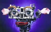
What’s more, apparently the gaze does not necessarily have to be convincingly human — instead, just human-like. The graphic you see to the right depicts an application of this is fascinating technique described in New Scientist magazine. Here’s the account, as I described it to my class:

The researchers split the group into two. Half made their choices undisturbed at a computer screen, while the others were faced with a photo of Kismet — ostensibly not part of the experiment.

The players who gazed at the cute robot gave 30 per cent more to the pot than the others. (Investigators Terry) Burnham and (Brian) Hare believe that at some subconscious level they were aware of being watched. Being seen to be generous might mean an increased chance of receiving gifts in future or less chance of punishment …

Burnham believes that even though the parts of our brain that carry out decision-making know that the robot image is just that, Kismet’s eyes trigger something more deep-seated. We can manipulate altruistic behaviour with a pair of fake eyeballs because ancient parts of our brain fail to recognise them as fake, he says.

Keep this in mind where you are seeking to design an ad or interface that you don’t want overlooked.

If you’re in the Milwaukee or Madison areas, please be sure to attend my second course, presented by C2: Web Analytics That Clients Love. It will be held in Madison on April 27, and Milwaukee on May 11. Either of these presentations is just $69, but the Milwaukee course continues its $59 Early-Bird Pricing for another 12 days.

I hope to see you there!
Multi-touch table magic, courtesy of MS Surface

Robert Scoble just posted this YouTube video of a demonstration of Microsoft’s Surface multi-touch tabletop monitor. Shot at last week’s Gnomedex, this video serves as a sneak preview of what this technology can do in a social setting.

Last month I posted about the new Bokode barcode. One application I described to friends was its use on trade show floors. The barcodes would be worn on presenter name tags, and reveal much about the wearers to any conference attendee wielding a smart-phone camera (the link to the Bokode post is below).

The MS Surface offers a different solution to the same challenge. It’s one of making the most of a networking opportunity. The tabletop displays the conference’s social graph, which can be manipulated and organized by anyone who steps forward and plops down their name tag.

Making the most of conferences

National conferences demand efficiency from its attendees. The cost in time and money is considerable, so many of us look at them as a competition to beat our personal best: How many relevant contacts can we make? How many friendships and business ties can we deepen? It’s all an effort to be efficient, and not fly home feeling we’ve overspent on a rare chance to make valuable face-to-face contacts.

This strong networking benefit is what’s convinced me that Microsoft is on to something. I suspect the main challenge with their tables will be the over-crowding that takes place around them. Conferences providing this technology will be hard-pressed to have enough tables to go around.

Related links:

Wearable computer hints at ways we might live digitally

Every year the TED conference introduces new and provocative ideas, many of which soon become commonplace. Two years ago, Jeff Han’s demonstration of multi-touch screens presaged the Microsoft Surface, and the first mass-produced multi-touch cell phone: the iPhone. These multi-touch screens are many things, but unencumbered is not an adjective that comes to mind.

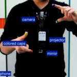
Even the iPhone requires you to hold a cell phone, which is a barrier for a lot of real-world applications. MIT Media Lab’s Pattie Maes explained the challenge at the latest TED conference. She said that, for instance, “If you are in the toilet tissue aisle of your supermarket, you don’t take out your cell phone, open a browser and go to a web site when you want to know which is the most ecologically sound toilet tissue to buy.” She and Pranav Mistry, also of MIT’s lab, have devised a potential solution to accessing this type of rich information in the real world. They call call this sort of computer interface their Sixth Sense. Here is the video of the computer demo.

The demonstration had the audience on their feet, cheering.

Here are three things I love about this concept, as crude as it currently is:

  1. It’s cheap, light and small
  2. It can very quickly become cheaper, lighter and smaller
  3. With video recognition, the need for colored finger-markers will be unnecessary (so will logging in, since it will recognize its owner’s unique fingertips from anyone else’s)

Wearable computers have been talked about for decades, but this is the first user interface that is starting to make sense to me.

When Jeff Han’s concept of multi-touch computer interfaces was presented two years ago, my blog post was effusive about the possibilites. Someday we might be able to work standing up — more prone to both creativity and collaboration (please excuse the obscure pun). The biggest barrier to this future was that darned wall-sized screen. With the Sixth Sense device, any white wall becomes a screen — and an inviting whiteboard for one or more knowledge workers to play in.

Do you agree that this crazy contraption has a lot of possibilities?

Designing an application around consumer behavior

A recent post on Experience Matters offered a great example of how you can design a user experience around an existing need. Their example is YouTube:

  1. Consumer Need: The ability to share themselves with potentially millions of others through site and sound.
  2. Augment Behavior to include Brand: In the case of YouTube … perhaps the best use of this network was not for a brand to spread its own content, but help consumers share their own. After all, the initial consumer need identified above was the desire for consumers to share themselves with the masses. Wouldn’t it make more sense to empower them in continuing this behavior rather than competing against them? If successful, this takes the process full circle and makes the brand-infused behavior become part of the original consumer need.
  3. Why is this behavior occurring?: YouTube made video distribution easier (on a mass scale) than ever before. It didn’t require hosting a server or website, or being isolated to sending your large files across flaky channels. From a content consumer perspective, YouTube and sites like it offer the depth and variety that professional producers simply cannot match. The quality (for now) of the content is obviously not comparable but consumers are willing to look past it because the content is original, very controllable, and often more personal.
  4. Consumer Behavior: Millions of people are uploading their thoughts, talents, and parodies onto a video sharing network. Even more millions of people are watching those videos (the majority of which are user generated, not professional).

They call this reverse engineering. But really, it’s simply finding a need and filling it in a unique and viral way. Major online successes are the clearest examples to describe this process because their imprint is so deep and the applications are so new and different from the status quo. Here’s another example:

The Birth of Amazon

Jeff Bezos set out to make an e-commerce site. Period. He reverse-engineered from a fundamental desire to buy something in your underwear (so to speak) and not to buy books. It turns out that books simply met the right criteria for ease of warehousing and shipping. Also, books were searchable in a vast and accurate — but, before Amazon, difficult to access — database.

The success of both of these examples is obvious. Len Kendall of Experience Matters defines success this way:When a brand can improve or change a consumer’s behavior so it still satisfies their initial needs.”

He goes on to say that a really big success is when a brand can radically change consumer behavior in a way that makes it virtually inseparable from the initial need.

The Killer App For Your Brand

What is the fundamental need that your audience wants to fill? How can you satisfy that need with your brand and some unique technology?

As an experiment, I tried this reverse engineering exercise with a brand that seems the very antithesis of high-tech. Next week I’ll reveal the brand and the solution.

If your site does any of these things, make a mobile version

Web usability expert Jakob Nielsen is admittedly “bullish” on the mobile web. But his recent post bemoans how lacking most web sites are when viewed on mobile devices. For most sites, his prescription isn’t a web design overhaul. Instead, he recommends creating a separate version specifically for the lowest common denominator mobile browser.

To be more precise, he recommends that only if your site is frequented by cell phones and smart phones should you make this investment. “Not all sites need mobile versions,” says Nielsen. “According to a diary study we conducted with users in 6 countries, people use their phones for a fairly narrow range of activities.

“So, because many mainstream websites won’t see a lot of mobile users, they should just adapt their basic design to avoid the worst pitfalls for those few mobile users they’ll get.”

Narrow Range of Activities

So, you may wonder: What is this “narrow range” of activities? The following list is a good summary. These happen to be the “behaviors users engage in when using mobile devices,” as described in the upcoming Usability Week 2009 Conference(s), presented by the Nielsen Norman Group and presented by Raluca Budiu in full-day tutorials.

The course description lists these activities. If your site has users doing any of these 11 activities, seriously consider designing or upgrading a mobile version for your site:

  1. Navigation to websites on mobile devices
    • Search
    • Portals
    • Bookmarks
    • Direct access
  2. Browsing for news, entertainment, sports
  3. Finding specific information (weather, movie times, etc.)
  4. Transactions (such as online banking and other financial operations)
  5. Using maps and location information
  6. Integrating e-mail and contact information with browsing and fact-finding
  7. Content management (ringtones, photos, etc.)
  8. Monitoring and communication
    • E-mail
    • Instant messaging
    • Online communities
    • Social networks
    • Discussion groups
    • And more
  9. Shopping
    • Finding information about a product
    • Comparing online and in-store costs
    • Purchasing
    • M-commerce
  10. Killing time
    • Video, music, and games
    • Accessing, choosing, and downloading content
  11. Accessing nutrition and health information

Far from a narrow range, that seems like a lot of functionality! In Nielen’s Utopia, we’d all be doing most of our work and online recreation from our phones. It seems more like science fiction than a glimpse of things to come.

So why exactly is Nielen so bullish on mobile? Here’s an excerpt of his reasoning in today’s post:

Mobile is the trend of the year in application design. While trends can be wrong, lots of interesting things are happening.

We’re turning a corner in mobile Web usability. Just as Apple’s Macintosh heralded a breakthrough in personal computer usability 25 years ago, its iPhone is pioneering a similar breakthrough in mobile usability today.

The iPhone is certainly not perfect, and competitors could easily make better mobile devices. By “easily” I don’t mean over a weekend. I simply mean that it’s possible to do it given a strong focus on user experience and user-centered design [UCD]; iPhone leaves a lot of ground for improvement. So far, however, iPhone competitors have been disappointing because they haven’t been created with UCD.

He goes on to write that, whereas mobile browsers may improve over time, it is the user experience designed into mobile web sites that will lead the way in the short-term. He explains, “There is immense potential for advances in mobile usability as more website, intranet, and enterprise software designers build mobile versions and revamp their current designs for usability.

“The mainstream Web’s state in 1998 actually provides a hopeful precedent: just a year later, in 1999, interest in Web usability began to explode as Internet managers realized how chasing ‘cool’ rather than usable design yielded poor business results.”

Nielsen concludes by stating that he hope history repeats itself. As we marketing technologists struggle to deliver more value with every customer contact (in today’s economy more than ever!), I see this being likely to happen.