Social network marketing (a.k.a. “social media”) has a mystique that will soon fade. That is both inevitable and a good thing.
It’s an effective technique that will join other similarly important marketing tactics. But hey, it’s not a cure for cancer. In fact, it ain’t even a shortcut to success, fame or riches!
At its best, when combined with hard work and a sure hand, social network marketing can help you sell stuff and improve customer service. (And I would say social media does far better at the latter than the former).
So: It will soon become yesterday’s news. Before it does, let’s remember its humble origins — or become acquainted with them for the first time.
Relationship Revolution
Before the web as we know it today was invented, Stanford sociologist Mark Granovetter wrote an influential paper called The Strength of Weak Ties. The ties he described, between acquaintances (as opposed to trusted friends and family, who supply strong ties), are what social media is all about. But get this: Granovetter first described them back when Richard Nixon was still in office.
I was reminded of this when I read a quote from the more recent past, by Michael Schrage.
You see, 13 years ago, while writing in something called the Merrill Lynch Forum, Schrage used the phrase relationship revolution. It didn’t stick as a buzzword, but its meaning and power has only grown.
Schrage was asked in the Forum to analyze how new technologies would transform businesses. His response follows:
Along every conceivable dimension — from the intimate to the institutional — digital media force both individuals and organizations to redefine what kind of relationships create value. [Schrage continued, to paraphrase:] The result of this paradigm shift isn’t about data and information, it’s about the value and priority that people place on the quantity and quality of their relationships.
The emphasis above is mine. Schrage and others wrote about weak ties as the power of consequential strangers — those who provide new value to us in this digital age. The new value can be as simple as helping us find new musical artists we’ll like (as I did in the screen capture above, using Twitter), or something as important as choosing a good school or seeking a reprieve from physically or social isolation.
All of this sounds far more recent than the mid-1990s (or the Nixon Administration!). It’s worth noting. As we all happily experiment in this exciting new medium — and before its bloom of “newness” has faded — let’s take a moment to remember the work of Granovetter and Schrage, and the power of consequential strangers.
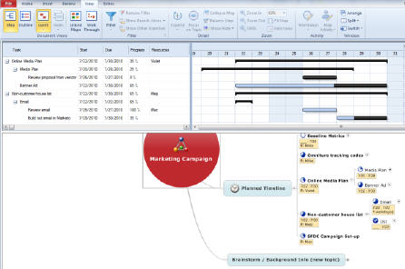
I’ve been an advocate of mind mapping for years, and have recently talked about my preference for using MindJet.com’s mind mapping product, MindManager. I even demonstrated its power, while leading a discussion about rich digital media, at an UnGeeked Conference in May. I find the system a huge time-saver. Now MindJet has upgraded their software to include a valuable way to share project roles, deadlines and milestones: Gantt charting.
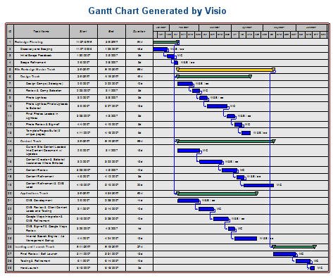
Since the 1990s I’ve appreciated the ability of Gantt charts to bring teams to agreement on project roles and deadlines. It’s an equally valuable way to show clients how any delay in supplying crucial content or sign-offs can push web launch dates out. Below is an example:
The detail is intentionally too small to make out, because I’ve used live client details. From left to right, this chart shows the task name, and start date, end date, and duration in days. After that is the chart itself. Milestones are the green bars. Every task within that milestone must be completed before the milestone is reached and the next milestone and task set begins.
My web development team would “own” some of the tasks, and the client would own others. At a glance, everyone knew what they needed to do and when. They also knew the effects on the project as a whole if they missed their deadline. Great stuff.
Needless to say I’m eager to give the Gantt charting a test spin. What’s especially exciting is it takes the collaborative strengths of building a mind map as a team and fairly quickly converts that shared map into a full-blown project plan.
One of the first adding machines was created in the mid-1600s. It took another two centuries before they were common in the workplace. Did adding up figures suddenly become more difficult or error-prone after two centuries? What exactly about numbers changed in the late 1800’s to make this new technology so suddenly appealing?
Of course the answer is that it was us who changed, not the fundamentals of math. To say we changed slowly is an understatement — in spite of the major economic improvements and workplace enhancements that came from their adoption.
It’s hard to imaging myself being one of those poor office clerks who added figures in his head all day, back in the so-called Age of Enlightenment. What I can be pretty sure of is this: A machine that does adding for you must have initially seemed far-fetched; even comical. How on earth could a machine do the work of the human brain? There must be some sort of catch.
Of course you know where I’m going with this.
Many writers of obituaries for the soon-to-be-euthanized Google Wave have said it was a slick solution lacking a problem. It therefore died of neglect.
I agree that it lacked a critical mass of users, but I disagree with the “lack of problem” assertion. Google Wave did real work, and it did it in a way that was flawed but thrilling for the vast potential it represented. At least, it thrilled me.
Ever since the mid-1990s, when I read the book of a very young Michael Schrage, No More Teams!: Mastering the Dynamics of Creative Collaboration, I realized that there were many barriers to good workplace collaboration. Chief among them was technology. Especially back then, personal computers were isolating machines. They forced us to relate with a small screen and a single keyword.
One of his observations was that before we could take the next incremental leap in teamwork, we needed a revolution in the technology that supports us. Of course he was right, but his pronouncement overlooked another barrier: We might be handed the technology we need to collaborate in a networked age and its environment so unfamiliar that it is almost universally rejected.
That would put adoption of the Wave at 200 years from now. In the meantime, I guess we all continue to add up columns by hand and grouse about our dreary workaday lives.
If you and I pulled up a site’s analytics, and I asked you to show me the key performance indicators (KPIs), the chances are good you’d start with Unique Visitors. Google provides that figure near the top of its Google Analytics (GA) dashboard.
Behind that number is a story that can make the best of us wince — or in the case of the esteemed Avinash Kaushik, laugh nervously.
The story behind it is like a cross between a Senate Budget Reconciliation Hearing and an episode of The Sopranos. It includes numbers that never add up, shifting definitions of a word (“unique”), and one powerful yet tragically flawed KPI that is quietly driven out to the woods and eliminated. Although the people at GA don’t call it that. They call it being “deprecated.”
I was reminded of this when a client emailed me asking for clarity. There had been a discussion of Google Analytic’s “Absolute Unique Visitors” and its “Unique Visitors.” She wrote: “So let me see if I have it right regarding the difference between an absolute and regular unique.  An absolute is someone who’s only visited once during said timeframe and is counted as one. Unique is someone who’s visited any number of times during said timeframe and is counted as one? Is this correct?”
My reply was longer than I would have liked, but had some things about it that could be helpful for others of my readers. A version of it is below, with all client information changed or eliminated. It began with this: “Your definition of the absolute unique visitor is exactly correct. Your definition of the (merely) unique visitor is also exactly as I’d described it — although in your description you used a “metric” (which is a type of visitor) to define a “dimension” (which is a number, as in a visit count).”
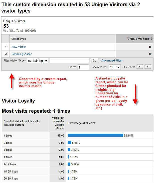
Here are two reports combined in one graphic, both from snapshots of a site's analytics. I chose it because of the numbers. They're small enough to add up; which is still often a tall order in web analytics. Also, because of their size, they
Metric versus Dimension, you say?
Understanding what a unique visitor is requires knowing a bit about how the system measures things.
Google Analytics allows for flexible reporting by creating categories of things, Dimensions, and then counting them using Metrics.
Think of how you describe a newborn’s vitals stats:
Weight = 6 pounds 5 ounces
Length = 18 inches
(By guessing at that last number I may have inadvertently revealed that I’ve never had a child or been around a delivery, and haven’t a clue what a typical newborn’s length is).
The point is the first part of the sentence is the dimension and the second part, which is the counting part, is the metric. Thrown in at the end is the unit of measure — ounces and inches.
Google Analytics blows people’s minds by having both a dimension and a metric to describe one thing: visitor frequency.
This is sloppy, and it’s a measure of how Google improves its products in gradual increments. GA is an analytics system that is excellent but experiencing growing pains.
It is here — with GA’s parallel accounting of visitors — that the whole unique visitor thing starts breaking down.
In October of last year Google started phasing out its predecessor, “ga:countOfVisits,” from which the “Absolute Unique Visitors” had always been generated.
Now when you look that old dimension, the data dictionary describes it this way: “… (deprecated) … See ga:visitCount.” If you look for ga:countOfVisits in the GA API data dictionary, you’ll even see it’s been grayed out.
The description goes on to say this now-mostly-vanquished dimension is the “Number of visits to your website,” and is, “calculated by determining the number of visitor sessions.”
So it’s “ga:countOfVisits = 1” that gave us Absolute Unique Visitor.
For my clients, when I look for that old workhorse of a KPI in the GA Dashboard navigation, I see it’s gone totally missing. Does yours still have it? The answer depends, I’ve been led to believe, on where you are in the phase-out yet. Eventually the Absolute Unique Visitor will be completely wiped out, in favor of “ga:visitCount = 1” — Unique Visitor.
There is also a metric (as opposed to those two dimensions I was telling you about), called “ga:newVisits.” This is extremely useful. But it is a metric, so it can only be expressed when paired with a dimension (is 18 inches meaningful at all if it wasn’t associated with a newborn?).
The data dictionary describes this metric as “The number of visitors whose visit to your website was marked as a first-time visit.”
The Man With Two Watches
This is a lot of ways to find the same thing — How many visitors, without repeating any, have come to your site? I’m reminded of the Chinese adage, “The man with one watch always knows what time it is. The man with two is never sure.”
The only reassuring news is this:
It is only analytics reporting that goes much deeper than a superficial number that actually provides actionable insights. Visitors — unique or otherwise — only become truly important to a business in terms of what they have done and what they’re doing now!
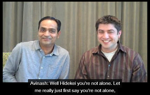
If you want to share a laugh about this topic, I present this YouTube video of Avinash fielding questions from viewers. He laughs nervously, but then provides the news that the phase-out is gradually progressing:
An inflection point is a term from calculus. It’s a place where a charted curve changes direction. Inflection points make interesting charts. They can also be harrowing for passengers zooming along the curve, hanging on for dear life. Just ask today’s struggling newspapers, publishing houses and record labels. Many would tell you that passing an inflection point is as fun as passing a kidney stone, only it takes longer. But the worst of a harrowing ride may be close to over.
At least for two industries, we may finally be rounding the midway point between mostly analog and mostly digital.
True, the delivery of DVDs to customers’ mailboxes is already partly digital. The first “D” in DVD is “Digital.” But reliance on the U.S. Postal Service to deliver those digital packages is fraught with expense and inefficiency; Expensive, because —  to quote Jeff Jarvis — atoms are a drag. And inefficient, because you need a physical warehouse of disks. Only a finite number  of people can watch the same film on the same day.
Then, earlier this week, I read that Amazon is now selling more e-books than hardcovers. The speed of this shift to reading on Kindles, iPads and other e-readers is a surprise even to those who should know better. Amazon says they now sell 180 e-books for every 100 hardcover books. A few months ago it was only 143 for every 100!
This is even more astonishing when you take into account that, according this New York Times article, “Amazon has 630,000 Kindle books, a small fraction of the millions of books sold on the site.”
Change is painful. But the worst pain is cyclical.
Sometimes it feels like the world is racing to a terrible future — similar to the ancient world maps where waters on the outer fringes had sober warnings of sea monsters. But at least from a cultural / technological perspective, call me an optimist. (I don’t speak here of the world’s geopolitical or ecological fate, and don’t get me started!)
I believe the voyage around this and similar inflection points is taking us to a pretty cool place. We just need to hold on tight and be prepared when we hit land. The other side of this curve will be as brimming with opportunity as it is different from the world we know now.

 It’s hard to imaging myself being one of those poor office clerks who added figures in his head all day, back in the so-called Age of Enlightenment. What I can be pretty sure of is this: A machine that does adding for you must have initially seemed far-fetched; even comical. How on earth could a machine do the work of the human brain? There must be some sort of catch.