In a perfect world, all A/B and Multi-variate Tests you conduct should be as expectantly observed (and ghoulishly revisited) as the one conducted last week, pictured above.
Before the test launch of SpaceX Starship, Elon Musk said there was a one-in-three chance it would not survive to a successful landing. He was wise to set expectations. It exploded upon contact with the earth.
How do you handle and publicize your failed tests? I hope you celebrate them for the data you gathered. Put yourself in Musk’s shoes: He paid dearly for a pile of burned shards, but in return he got measurements throughout the flight that will help him rocket above the competition (sorry) to claim the profits in manned space flight he is chasing.
The only true failed experiment is the one where the data gathered is not applied to future efforts.
Workflow management is often an afterthought. That’s a big mistake, especially when it comes to marketing execution. The late Eliyahu M. Goldratt told us this in his books from nearly forty years ago, starting with The Goal, and especially its follow-up ten years later, It’s Not Luck.
Those books are ancient business history, yet this proven competitive advantage continues to go ignored by most enterprises. I know. I’ve seen it in my many years of digital marketing consulting. But things are starting to change. What’s more, I consider Adobe’s announced plan to purchase Workfront as a sign that this progress is accelerating.
Let’s face it: Workflow management isn’t sexy. But following the adage of You can’t manage what you don’t measure, the pace of executing your marketing strategy can stall if you aren’t identifying and fixing constraints in the pipeline. That’s where Workfront shines. But first, a little more about how we got here.
The Theory of Constraints
Goldratt initially created his Theory of Constraints (TOC) because Western manufacturers were quickly losing ground to the Japanese makers of cars, televisions, and much else. At the time he maintained that improved throughput was a secret weapon for the modern manufacturer … and marketer. (He looked at several categories of workflow in his books, and devoted It’s Not Luck to marketing effectiveness.)
Speed-to-market — what Goldratt called throughput — reduces inventories, stabilizes costs, and helps a brand prevail over less-nimble competitors. Out of Goldratt’s work (along with others of his ilk) came entire categories of TOC-driven productivity, most notably modern logistics.
Let’s look at a common marketing example:
It’s a competitive no-no to take many weeks between conceiving a campaign and its execution, using a tool like (in this example) Adobe Campaign. But constructing campaigns in Campaign is hard work! There are so many skilled hands that must touch the work product, in sequence or in parallel — doing everything from copy writing and photography to graphic design, data science, coding and quality assurance (QA) testing.
Non-waterfall approaches to the work, particularly Agile, are, to use a phrase that is the title of another of Goldratt’s books: Necessary but Not Sufficient. Agile in this context is no panacea.
Achieving Spreadsheet and Email Escape Velocity
In order to move the work efficiently, you need to get everyone out of the tyranny of email threads and shared Excel spreadsheets. Managing projects of this complexity must be handled by a platform, with automated hand-offs and reporting.
I can hear some of you now: “We’re good. We have Jira to do that!” or “We have [the Microsoft Jira clone] Azure DevOps [ADO].”
Yeah, no.
Marketing involves more than technologists. It demands creatives, plus many layers of stakeholders. These folks haven’t the patience to learn the language and interconnections of those development and bug-fixing tools.
Workfront is the industry leader in providing a marketer-friendly solution. I’ve seen it in action. It can track campaigns, A/B tests, tagging, insight generation and much more. It does something else that would have warmed Mr. Goldratt’s heart.
Finding and Fixing Bottlenecks
You’ll recall that the “C” in TOC stands for constraints. And a constraint is just a fancy word for a workflow bottleneck. These are the slowest stages in the path leading to a successfully delivered project. Typically, Goldratt observed, you can only see one of them at a time. That’s because if you observe work piling up at a particular step, the system upstream slows, making other, upstream bottlenecks undetectable.
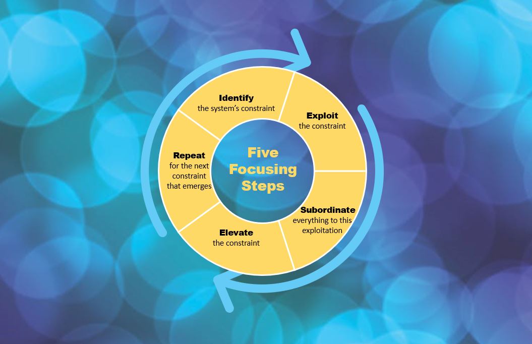
Thus the 5-step cycle that he described in his books, and is shown at the top of this post.
Another clarification: By “exploiting” constraints, Goldratt had simply meant opening up the log jam. In manufacturing, (and frankly, also in marketing project management), that can mean things like this:
Doing as much QA as possible before the constraint
Hiring a second resource
Adding a second or faster machine used to do the work
Once you’ve cleared one logjam, it’s guaranteed that will expose another. That’s just life in project workflow management.
You can do none of the work I describe unless you have the reporting necessary to see the bottlenecks. And if you’re using manual reporting today, just realize that won’t scale as capacity increases.
These productivity reports are where Workfront really shines. Marketing projects managed this way move through the system more smoothly and create an environment conducive to other improvements, e.g., unanticipated process innovations.
You cannot manage what you do not measure, indeed.
Managing Inputs and Outputs from Adobe Platforms
All of this is why I’m so pleased that a major digital experience company has decided to buy Workfront. Arguably every platform in the Adobe Experience Cloud has inputs and outputs that must be managed by many types of roles. By eventually providing a workflow management tool to knit together this work, the value of Adobe’s cloud will grow.
As a process guy, I’m loving this development. But let me know what you think. I’ve turned off comments, but I have an extremely “googleable” name. You can find me on social media and let me know your thoughts.
Adam Greco has been doing digital analytics implementations since before Adobe bought Omniture (now Adobe Analytics). I go back nearly that far, and have religiously studied his blog posts on the topic. He’s saved me hours of work. So I was thrilled to talk to him the other day about a new product category invented by his latest employer Search Discovery: Apollo, an Analytics Management System. I’m impressed, but I’ll be calling it a Digital Insights Time Machine.
Here’s why:
Excellent Digital Governance
If you’ve been in my shoes, and Adam’s, you know the trouble an organization can get into if it doesn’t have buttoned-up digital governance. Like when an enterprise lacks a clear insights generation strategy.
You see, that strategy describes business goals and objectives. and from them, predicts the reports that will be needed. This measurement strategy answers the question, What user behaviors are needed to achieve our business goals? Many organizations skip this step, and go right to implementation … Often trusting analytics team members with little understanding of business (!). This leaves these implementation pros having to make a best guess at what reports the enterprise will need down the road.
Imagine you’re someone responsible for an implementation of Adobe Analytics, and the chat window lights up with a request from your boss’s boss. Or boss’s boss’s boss. “Can we get a report on XYZ?”
When there is excellent digital governance in place. the answer you give is almost certainly Yes. But if you don’t, you’re faced with telling someone in control of your career that the report requires metrics that are not currently measured. Worse, the implementation will take weeks or even months because a change to the digital analytics data layer will be needed, and IT has many hotter priorities.
If you’ve faced this moment of white hot panic, you probably have wished you could climb into a time machine and make sure those metrics get implemented out of the gate.
Apollo is that time machine.
The first thing you’ll see, if you get a demo like the one Adam showed me, is Apollo’s best practice library of business requirements, for reporting and insight generation.
The list is vast, literally hundreds of requirements.
Search Discovery — relying in part on Adam’s deep experience with clients in every industry — have provided building blocks for any type or hybrid of online business . From these business requirements flows all of the metrics and dimensions that will be needed to address them in reporting.
Then things get really interesting
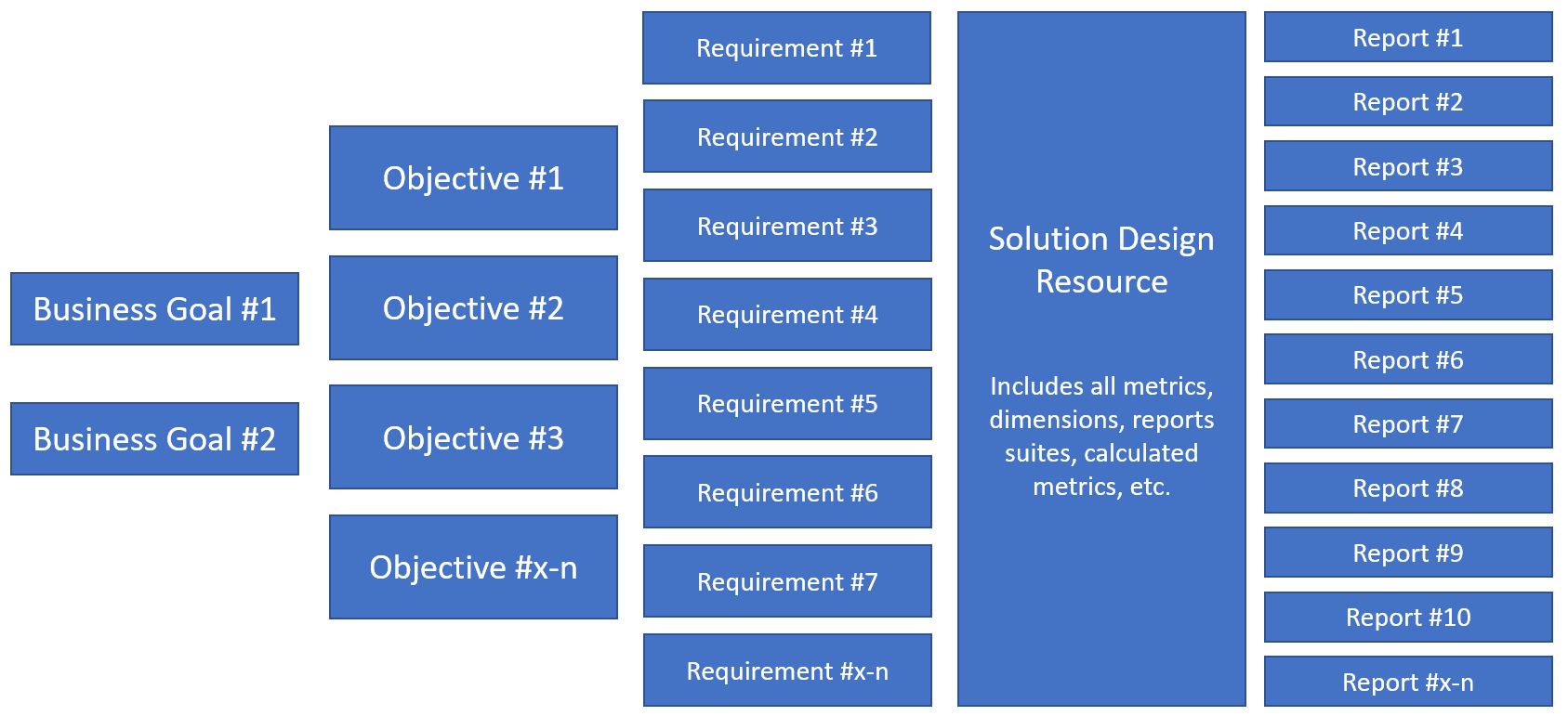
This shows part of the flow that is followed as you set up your Apollo instance:
Everything following out of the Business Goals and Objectives of this Measurement Strategy value tree is prompted from you by Apollo. Keep in mind that I’ve avoided arrows in the graphic, that would typically connect boxes from one column to the next, but as you likely have guessed, there is a one-to-many relationship flowing from left to right, with all the relationships being contained and documented within the Solution Design Resource (SDR).
If you state a requirement such as “I want to report how many orders are placed each day, week, month, etc.,” you select that requirement as needed and Apollo automatically adds all of the variables, data layer objects, tagging, etc., that you’ll need to track within the SDR.
More about that SDR: Unlike all of the SDRs I’ve ever encountered, the one in Apollo is part of its relational database. That means it can be exported to Excel if you feel inclined, but lives as a dynamic document that revises itself every time you make a change to requirements, metrics or reports.
So when you join an organization using Apollo, you never have to encounter all of the lapses and omissions that come from an SDR that is only half-heartedly updated as an Excel file (often in several versions, causing you to wonder which contains the most “honest” implementation snapshot!).
Leveraging APIs to Adobe Analytics, Launch, and even Workspace
How does Apollo populate your instance of Launch? It’s connected via API to your instance of of both Adobe Analytics and Launch. Since it adds Launch tags, all that’s left is for you to do is refine its work and begin the testing.
And because most implementations require IT to install or update the data layer, Apollo auto-generates the JSON code for that data layer. This makes the work of IT easier, improving the odds of speedy deployment.
Finally, Apollo helps you at least two ways to debug the implementation once it is deployed. It uses those API connections to identify errors, and pushes to Adobe Workspace the reports that can make visual review of the data easier.
Speaking of Workspace, all of the reports that are specified in this digital analytics “time machine” are pushed there, so all you’ll have to do is review and refine them.
Apollo has impressed me so much that I can’t wait to get my hands on the working system, for my first client to use it. If you’re also intrigued, contact Adam for a demo. Like me, you’ll get a glimpse into the future of our industry, where we can spend more time on strategy and insight generation, and less on wrangling code and change requests.
Solving complex business problems “ain’t always rocket surgery,” to cite a colloquialism I just discovered. It often boils down to a little bar and a big bar.
As an outsider, I have the luxury of both working with data scientists and in gentle opposition. The first part is easy. Data scientists work with my clients’ data daily, and have produced elaborate models to help make things more understandable.
But I also work in gentle opposition. To quote best-selling author and distinguished professor of economics (and fellow “outsider”) Steve Levitt, it’s all in the incentives. He’s excerpted immediately below from one of his People I (Mostly) Admire podcast episodes. You can listen to this one-minute audio clip by clicking the player, or read on … the transcript immediately follows it.
Little Bar / Big Bar
When I work with firms that have data scientists, what I find almost uniformly is that they operate in an incredibly complex space. They’re very concerned with technicalities, with techniques, with things being hard. And I think the answers are often very simple. So I try to always do simple things, and try to relate them in very basic ways. Like, my favorite kind of graphs are Big Bar / Little Bars graphs.
They’re graphs that have one really little bar … and one really big bar, and those are the kind of graphs that I show to CEOs if I’m trying to convince them of something. And the CEOs say to me, ‘Wow, that makes sense to me. I don’t understand how you take the same data that my data science team has and I never understand anything they’re saying.’
So, you might say ‘The answer is to do things really simply,’ but I think it’s more complicated when you think of incentives. Because much of the power that comes to data scientists in firms and organizations is because they are completely and totally inscrutable. And the other people have no idea what they’re doing. And by having a set of skills that no one else has, you can wield power because no one understands why you’re doing it. You have a very special talent. And so, I have the luxury of being an outsider.
Steve Levitt, “I’m Not as Childlike as I’d Like to Be” | People I Mostly Admire Bonus Episode
Wow! Can I relate. I hear this frustration when I talk to the leadership within my clients. Which is why I have espoused simplicity in everything I report, and have for years.
Of Oracles and Job Security
At the end of a talk I gave in 2018 about experience optimization, I urged the audience to think of themselves as modern day oracles. But instead of the literal magic tricks that the Greek vestal virgins employed to keep their jobs, we only have our science to keep us regarded as useful and legitimate.
Scrupulous science.
Many data scientists stop there. They generate reports using the latest and greatest methods, but when the output is shared, business leaders too often have no clue what the data is telling them.
That quote I shared with you from Steve Levitt was in response to a question about the future of data science as a profession. If you are a data scientist, consider this advice: Spend more time listening to your employer about the problems dogging them. And if you’re one of those employers, you cannot go wrong by hiring, when appropriate, someone outside of the data scientist industrial complex to whip up the bars!
Many years ago, when self-proclaimed Email Diva and my own personal career doppelganger Melinda Krueger conceived of the Disaffection Index, my only qualms were with its name and acronym. She wrote about this campaign KPI in one of her MediaPost pieces. If I remember correctly, she even sent me a pre-read. I told her I loved the metric but predicted it would become more commonplace with campaign marketers if she gave it a TLA (three letter acronym). I was only half joking.
You be the judge. First, what is it?
Rather than unsubscribe / delivered, the DI is calculated by dividing unsubscribes by the response rate …
Calculated this way, the DI tells you how many people either a.) clicked on your e-mail for the sole purpose of getting off your list or b.) were so dissatisfied … they chose to unsubscribe.
Excerpt from “The New Unsubscribe Rate”
Today every subscriber and brand loyalist is worth too much to squander. So why isn’t this KPI on every campaign manager’s dashboard?
Last Click Index (LCI) to the rescue!
I humbly suggested at the time that LCI was a better term for two reasons. First, it adds drama. When someone unsubscribes, you’d believe you weren’t getting any more clicks from them. B*tch, bye!
And secondly, I had then and still have zero affection for the word disaffection. But it’s her baby, and a rose is a rose by any name. (Clever guy, that Shakespeare).
So if you’re a campaign marketer, start using it, regardless of its inferior name. You’ll thank me. And Melinda.
Melinda is currently an Associate Principal for the Salesforce Marketing Cloud, and I predict she will laugh heartily when she reads this. I do hope so. I miss talking shop with her!