This is a follow-up to my post from last month. In that Part 1, I wrote about how shifting the ranges for heat maps and starting bar charts at numbers greater than zero can deceive. In this installment, I want to introduce you to the greatest source of lies in data visualization: Cognitive biases of their authors.
I started my earlier post with an example torn from the headlines. I will again below.
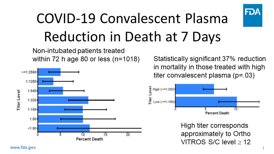
If you follow the latest news in the U.S. about Covid, you may have seen this graphic shared over the weekend, included as evidence for emergency approval of convalescent plasma as a treatment for the infection. The evidence was provided by FDA Commissioner Stephen Hahn. His chief graphic is shown in the above image.
The graphic appears to show a 37% reduction in deaths for Covid patients receiving infused plasma from donors who have survived the infection. Famously, Tom Hanks and his wife donated their plasma to help the research being conducted world-wide.
Rounding down to 35% in a press conference, “A 35 percent improvement in survival is a pretty substantial clinical benefit.”
“A 35 percent improvement in survival is a pretty substantial clinical benefit,” FDA Commissioner @SteveFDA said in relation to the convalescent plasma emergency use authorization issued today. pic.twitter.com/Dd97vLSZeL
— U.S. FDA (@US_FDA) August 23, 2020
It is, but that isn’t what the data shows.
After an outcry from what seemed like just about everyone in Covid research whose name was not Stephen Hahn, he apologized. The drop in mortality was from roughly 11% to 7%, which is a drop of somewhere around 4%, not 37%. It was also from research on a small sample size, weirdly without a control group, among many other concerning factors.
In an administration that is arguably more politicized than any in recent history, the impulse is to say this U.S. government official lied. Strictly speaking, he most certainly did — in both his words and his supporting data visualization. But the motivation could be less nefarious — or at least, more common.
Cognitive Biases Can Make Us Lie to Ourselves
Our brains are not the perfect instruments we delude ourselves into believing. Consider the Free Brian Williams episode of Malcolm Gladwell’s podcast Revisionist History about the fallibility of human memory. Or more relevant to this instance of (self-)deception, consider this roughly 10-minute excerpt of a talk I co-presented in 2018 at Adobe Summit in Las Vegas. In that talk I explain why clear, data-focused hypotheses are an important protection a data scientist has against cherry-picking or distorting data to pronounce a test a winner.
In that talk I explained that we as marketers exploit consumer cognitive biases every day, including through the use of A/B testing tools like Adobe Target. That’s a good thing, from a marketing perspective. I also maintain that there is strong evidence all of us, regardless of our training and discipline, probably have biases that literally pre-date us as humans. These biases can cause us to lie to ourselves, and through those self-deceptions, lie to our clients.
Everyone wants to report successes. But science is hard, and replication of test results is a persistent problem. In addition to clear hypotheses, we can also conduct an exercise called preregistration to save us from ourselves.
The Killer of Truth Is Calling From INSIDE THE HOUSE!
In my first installment I talked about how easy it is to distort numbers by using bad or lazy visualizations. In this second and last installment, I want to remind you that a far more pernicious murderer of the truth is your own best intentions. I’m willing to give Mr. Hahn the benefit of the doubt that he wasn’t so much lying as practicing wishful thinking, which blinded him from many clear contraindicators of his conclusion — including the fact that randomized trials of convalescent plasma at scale is dead simple to conduct. They’re indeed being done elsewhere in the U.S., such as at UCLA — where Tom Hanks donated his plasma — and in other countries around the world. Yet no country has rung the bell on such a decisive victory over this horrible virus.
Let his humiliation be a lesson to us all.
