Musical genius Tom Waits once quipped, “Everybody I like is either dead or not feeling well.” This week I took comfort in these words as I was in the throes of a terrible cold. Everyone I knew, it seemed, was either sick or succumbing. As often happens, this got me wondering how widespread the virus really was.
In the past I’ve been frustrated. Maps of everyday pandemics aren’t easily come by. But today I got an emailed link to an interesting new Google mash-up. The link was sent to me by friend and lighting designer extraordinaire Noele Stollmack (who has been begging me to mention her in my blog for months*). A bit of an amateur epidemiologist herself, she confessed in her email that WhoIsSick.org is the “first social networking site that has piqued my interest.”
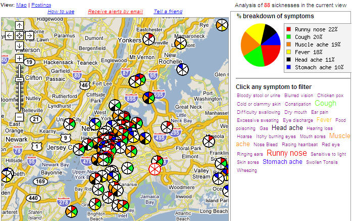 Noele is actually jumping the gun a bit. It may become a social network someday, but for now it’s a promising database / mapping application showing the spread and concentration of collections of symptoms. Participation is still quite low, but I like the concept. The image at the right shows a tag cloud of the symptoms reported in the Manhattan area. If you click on the image you’ll get an expanded view that shows the NYC Google Map with the distribution of these symptoms.
How are you feeling? If the answer is not well, go to WhoIsSick and type in your ZIP code. You’ll see who else is sick in your area, and have a chance to add your malady to the mix.
Try it. It might make you feel a little better.
*Actually, Noele Stollmack finds blogs “too personal and self-indulgent” to waste her time with, which is reason enough for me to create this Google bomb that ranks high when anyone searches on the phrase noele stollmack. 🙂 Back atcha, Noele!