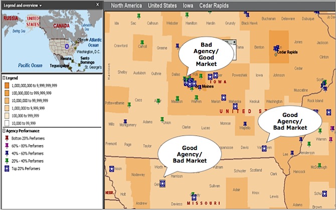
According to this Harvard Business blog, posted by John Sviokla, the headline is a quote often attributed to Napoleon Bonaparte. Below is a sample of a “sketch” that illustrates his premise that there are three strong reasons to pay attention to data visualization when tackling business problems.

I came across this through Holy Kaw! from Alltop. Sviokla’s three reasons to provide data visualization are actually questions to ask yourself when you face a problem, or process improvement challenge:
- Is there a simple map or maps of information that could make my life easier?
- Do we have the ability to take the myriad data and synthesize it into these new forms?
- How much time does the organization waste arguing about the facts instead of deepening understanding or crafting solutions?
The take-away: It doesn’t always work, but there are times where you can best solve a problem — and win consensus for that solution — by giving the data over to your graphing software. (My personal favorite way to show data online is Google’s free charts API).