How to lie with data visualizations, Part 2

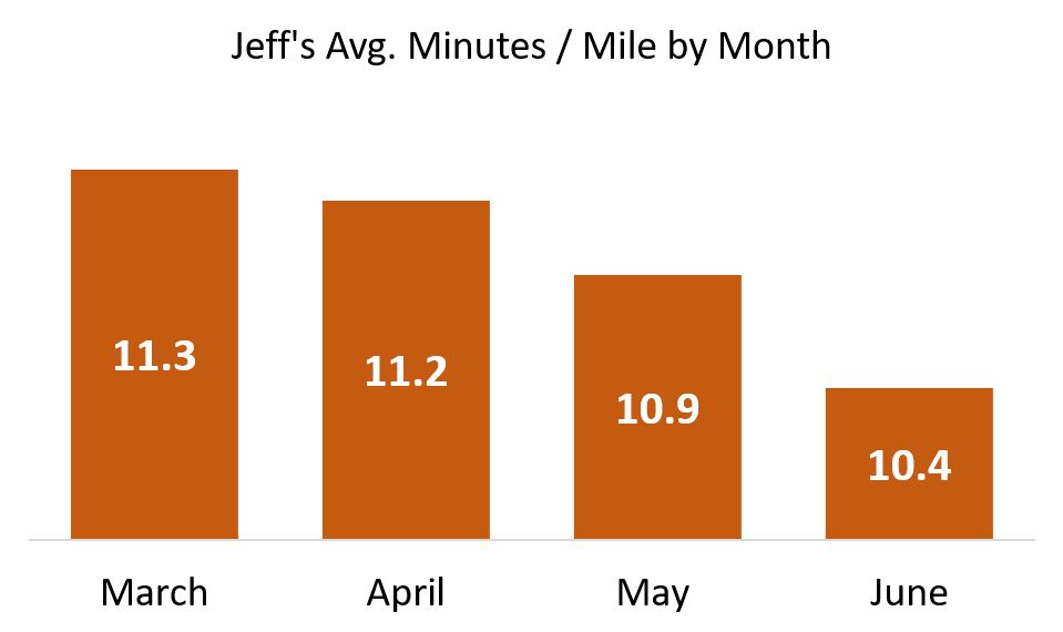
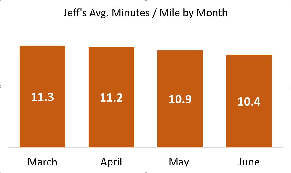
This is a follow-up to my post from last month. In that Part 1, I wrote about how shifting the ranges for heat maps and starting bar charts at numbers greater than zero can deceive. In this installment, I want to introduce you to the greatest source of lies in data visualization: Cognitive biases of their authors.

I started my earlier post with an example torn from the headlines. I will again below.

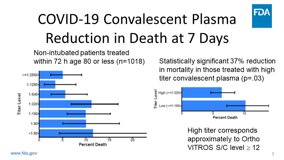
If you follow the latest news in the U.S. about Covid, you may have seen this graphic shared over the weekend, included as evidence for emergency approval of convalescent plasma as a treatment for the infection. The evidence was provided by FDA Commissioner Stephen Hahn. His chief graphic is shown in the above image.

The graphic  appears to show a 37% reduction in deaths for Covid patients receiving infused plasma from donors who have survived the infection. Famously, Tom Hanks and his wife donated their plasma to help the research being conducted world-wide.

Rounding down to 35% in a press conference, “A 35 percent improvement in survival is a pretty substantial clinical benefit.”

It is, but that isn’t what the data shows.

After an outcry from what seemed like just about everyone in Covid research whose name was not Stephen Hahn, he apologized. The drop in mortality was from roughly 11% to 7%, which is a drop of somewhere around 4%, not 37%. It was also from research on a small sample size, weirdly without a control group, among many other concerning factors.

In an administration that is arguably more politicized than any in recent history, the impulse is to say this U.S. government official lied. Strictly speaking, he most certainly did — in both his words and his supporting data visualization. But the motivation could be less nefarious — or at least, more common.

Cognitive Biases Can Make Us Lie to Ourselves

Our brains are not the perfect instruments we delude ourselves into believing. Consider the Free Brian Williams episode of Malcolm Gladwell’s podcast Revisionist History about the fallibility of human memory. Or more relevant to this instance of (self-)deception, consider this roughly 10-minute excerpt of a talk I co-presented in 2018 at Adobe Summit in Las Vegas. In that talk I explain why clear, data-focused hypotheses are an important protection a data scientist has against cherry-picking or distorting data to pronounce a test a winner.

In that talk I explained that we as marketers exploit consumer cognitive biases every day, including through the use of A/B testing tools like Adobe Target. That’s a good thing, from a marketing perspective. I also maintain that there is strong evidence all of us, regardless of our training and discipline, probably have biases that literally pre-date us as humans. These biases can cause us to lie to ourselves, and through those self-deceptions, lie to our clients.

Everyone wants to report successes. But science is hard, and replication of test results is a persistent problem. In addition to clear hypotheses, we can also conduct an exercise called preregistration to save us from ourselves.

The Killer of Truth Is Calling From INSIDE THE HOUSE!

In my first installment I talked about how easy it is to distort numbers by using bad or lazy visualizations. In this second and last installment, I want to remind you that a far more pernicious murderer of the truth is your own best intentions. I’m willing to give Mr. Hahn the benefit of the doubt that he wasn’t so much lying as practicing wishful thinking, which blinded him from many clear contraindicators of his conclusion — including the fact that randomized trials of convalescent plasma at scale is dead simple to conduct. They’re indeed being done elsewhere in the U.S., such as at UCLA — where Tom Hanks donated his plasma — and in other countries around the world. Yet no country has rung the bell on such a decisive victory over this horrible virus.

Let his humiliation be a lesson to us all.

How to lie with data visualizations, Part 1

The last time our world experienced a virus of Covid-19 lethality, our public discourse was not that different than today’s. Of course I’m talking about the 1918 Spanish Flu. Even its name is a lie. It was called that in U.S. newspapers not because Spain was the origin of the virus but because Spain was a neutral party in World War I, which was blazing at the time.

How’s that, you say? While other countries embroiled in the conflict didn’t want to spook their citizens back home by honestly assessing the toll the deadly flu was taking on their troops, Spain was more forthright. More than most countries, Spain even took precautions such as strict quarantining and social distancing.

Following the dictum that no good deed goes unpunished, Spain got to “own” the flu appellation in the U.S. press because of those actions, in a xenophobic slight not unlike the way French fries — as beloved during the time of our multi-country occupation of Iraq as they are today — became known for a time as “freedom fries.” Why? France did not choose to join our little alliance. And we all know how successful that nation-building adventure was.

It makes you wonder when we will start paying attention to what our European neighbors are thinking. They occasionally may be onto something.

Hey, we’ve got this!

So what has this got to do with data visualizations? Just that powerful systems often try to deceive as a way to hold onto power. This can involve the systems disclosing data they possess to their constituents in a way that assures the inattentive Hey, we’ve got this! I’m going to show you an example from my recent work, but first, let me show you the data visualization pants-on-fire deception that got me typing in my basement instead of enjoying this sunny Saturday afternoon ..

This is a set of charts — one from July 2, and the other from today, July 18. In those two weeks, can you spot the 50% increase in cases per thousand? (I verified today’s number on the Georgia Department of Health website just now, and confirmed the July 2 screencap is legit as well).

Made more infuriating when you realize human lives are at stake, the graphic is right below this statement: “The charts below presents [sic] the number of newly confirmed COVID-19 cases over time. This chart is meant to aid understanding whether the outbreak is growing, leveling off, or declining and can help to guide the COVID-19 response.”

Okay, quiz time: Can you spot the increase in this before-and-after map?

Map before

If you haven’t caught it yet, I’ll give you the explanation that @andishehnouraee provided: “[Georgia Governor Brian] Kemp’s health department keeps changing the numbers on the map’s color legend to keep counties from getting darker blue or red. 2,961 cases was Red on July 2. Now a county needs 3,769 cases to show red. The result: an infographic that hides data instead of showing it.”

I find this indefensible. I will say other graphics on the same page definitely show a spike. But if I’m a Georgian and I look for my county on the only map on the page, how am I to know that my community has half again more confirmed cases than it did two weeks ago? This data visualization “shell game” may persuade inattentive citizens of a given county to not social distance, or wear a mask in public, and thereby cause further infection in an actual, honest-to-goodness public health crisis.

[Some Redditors have said these maps were designed to show county-to-county differences, but I’m not buying it. When you choose a color scale, either keep the numbers the same for the colors or don’t use numbers at all, and show percentages. The typical citizen isn’t going to spend more than a few seconds looking at the map, and will get the wrong story from this one.]

How to deceive using shifting scales, with Excel as your accomplice!

The above is an example of: If you don’t like the data, change the base numbers. Another, more common way is to not clearly show your bar charts or line charts starting from zero where the axes meet. Let’s say I am trying to improve my abysmal running pace, and share my progress with the world (These are real numbers, but give me a break … I’m an old nerd, not an elite runner!):

Look at this glorious chart! I can hear you exclaiming: What progress you’ve made, Jeff! But is it really that impressive? Of course not! When I popped these numbers into Excel and hit Insert Bar Chart, Excel did some editorializing. It started my Y-axis at 9.8 minutes per mile. And in doing so, it made me look like to the inattentive as though I’ve halved my time since March!

Let me repeat: Excel did this handicapping of my pathetic times automatically.

To get a real world view of my running — a world which includes rare athletes who have completed  marathons at far less than half my personal best — here is the same graphic when the bars start at zero minutes per mile:

Not nearly the ego-boost, but it’s honest!

Scale breaks to the rescue

What if you just don’t have the room for all of that athletic plodding? In other words, what if my sad pace just wouldn’t fit on the slide, the bars being too tall? Yes, that’s a real thing, as I’ve pointed out in data visualization lectures:

Sometimes you want to take your audience all the way to the treetops, where the trunks are invisible but you can see which are the tallest of the majestic redwoods.

There’s this thing called a scale break  (shown below with a made-up data set):

Now you can see a chart that tells an honest story without messing up the scale of your slide. And you can focus your audience’s attention on the data that matters.

Watch this blog for a follow-up, with more tips on how to lie with data visualizations!