
Tag: CII

  • Hey TikTok, where is my check for inventing the metric that powers you?

    Hey TikTok, where is my check for inventing the metric that powers you?

    A spooky tale about a dead metric rising from the grave to take over the world

    This 2010 blog post of mine, Content Interest Index is the “missing link” in web analytics, outlined a novel metric that fills a measurement gap in a sales journey. Six years later, TikTok was launched with an algorithm that preforms precisely this measurement. And does it brilliantly. Here’s the story of my quest, and what it teaches us about finding and filling innovation gaps.

    I outlined the business case in an earlier post. It described why Content Interest Index (CII) needed to be invented:

    The first marketing class I ever had in college taught me the AIDA model of advertising. It’s still used today, lo these many years later. The AIDA model goes like this: [To make a sale,] once you attract Attention, you must generate Interest, create Desire, and enable your market to take Action. Do all of those things and you’re golden.

    Back then the only way you could actually measure any of these (except for the last A, which was making a sale) was by employing expensive and time-consuming research. The web changed all that. It allows us to measure each of these steps — except for that pesky thing called Interest.

    When I posted that I was leading a team of web developers. Using Google Analytics 1.0, I added client-side instrumentation to measure proxies for the interest levels of visitors in the pages of a financial institution’s website. Those proxies included how many people shared a page, bookmarked it (a thing back then), or sent it to PDF for printing. 

    With those behavioral proxies we hoped to calculate the comparative “interestingness” of this client’s content. Unfortunately our contract expired and I was never able to analyze the results and calculate the likelihood of CII to predict entering a conversion funnel (Desire) and achieving an online conversation (Action).

    I soon moved on from that agency, and also concluded the client-side instrumentation available at the time would never provide enough of a signal to be useful. I considered CII a dead metric.

    Then came TikTok.

    The breakthrough of ByteDance was using newer, real-time technology to create an app that leveraged its own proxies for interest, and prioritized them in a scoring model that could revise itself in milliseconds.

    According to this Wall Street Journal investigation into TikTok’s secret — and extremely addictive — algorithm, the app prioritizes engagement signals including likes, follows, and watch time. Most notably, “We found that TikTok only needs one of these to figure you out: How long you linger over a piece of content.”

    They found what many of us have experienced firsthand: Within minutes of lingering even slightly longer on a particular video type, TikTok adjusts your feed to show more similar content.

    This methodology became a blueprint. Meta adopted similar interest-duration models, and within years, interest measurement became the industry standard. In January, TikTok formalized its U.S. operations with an investment group, valuing the platform at approximately $14B USD, a vindication of the algorithm’s effectiveness.

    The Takeaway for You: The AIDA model had a digital analytics blind spot, and for years, we couldn’t find a way to fill it. Rather than accepting that limitation, I tried to bridge the gap.

    You likely face similar blind spots in your current behavioral analytics work: metrics you can’t measure, customer signals you can’t track, or questions your tools can’t answer. That gap is where innovation lives. When you find it — and have the persistence to investigate — you may be creating the next industry-standard metric.
  • When Virtual Pageviews trump Events

    There was much excitement when Google Analytics unveiled its Events metric. This meant web analytics could store several levels of information on a specific action, and associate that information with a unique web visit and visitor. Before that, if you wanted to — let’s say — record a download, you’d need to create a Virtual Page View.

    So why did I recently blog on Jason Falls’ site about creating Virtual Pageviews when recording interest actions, such as “Send to a Printer,” or sharing actions, such as “Email a Friend?” or “Share on Facebook?” Why don’t I just create Events?

    Using AddThis To Talk To Google Analytics

    The answer is simple: If you consider sharing to be a goal of your site, you may want to set it as a Google Analytics (GA) Goal. Events, for all of their power, can’t be set as Goals.

    Another action that Events are commonly used for is downloading white papers. Events seem perfect for this because you can set and capture a number of variables, such as title. In other words, you can set the Event Label as the title of the paper. But if you want to measure this as a Goal in GA, you’re out of luck.

    Events don’t even “talk” to Goals. [This is no longer true – changes to GA allows any event to be used as a Goal – JL] Let’s say you want to generate a report showing how many people who downloaded a white paper remained on the site for three or more minutes. The time on site can be set as a GA Goal, but you can’t easily generate a report showing the percentage of those who downloaded that remained on the site for that time period.

    You can do all of this with GA Virtual Pageviews.

    My rule of thumb is this: If you need to identify more than one variable with an event (such as identifying various Actions and Labels), and you do not need to correlate these with GA Goals, used Events. For all else, stick with Virtual Pageviews.

    How To Track Content Interest Index In GA Using AddThis

    Here is that how-to post I was referring to:

    How To Measure Interest Using Google Analytics and AddThis, posted on Social Media Explorer by Jason Falls.

  • Visualizing bounce rates using brownie charts

    Today on Jason Fall’s Social Media Explorer, I discuss my new favorite data visualization technique — one that I’m starting to move into production with web analytics reports I create for clients. Its official name is the Tree Map, but as I mention in that post, I prefer to call it The Brownie Chart.

    That post has an example of how I use brownie charts to show a promising new web metric, the content interest index (CII). My example on the site uses a made-up business, Everything Brownies, with a web address of EB.com.

    Note: Yes, I know. That web address resolves to a real encyclopedia site. The reason I didn’t just make up a domain name is you never know when one will go live with a site. I didn’t want to have someone inform me, two months from now, that my blog is now pointing to a porn or gambling site! Unless Encyclopedia Britannica takes a surprisingly sleazy turn, I think I’m safe.

    Here is another example of how the tree map / brownie chart can make web analytics reporting easier to understand:

    Charting Bounce Rates: “I came, I saw, I puked.”

    I agree with Avinash Kaushik that bounce rates are a helpful way to measure how well you’re connecting with site visitors. Actually, he’s a little more enthusiastic than I am, with blog post titles such as this model of understatement: Bounce Rate: The Sexiest Metric Ever? Three years ago, on his own blog, Avinash described bounce rates this way:

    So what is this mysterious metric? In a nutshell bounce rate measures the percentage of people who come to your website and leave “instantly.”

    They’re the one-page visitors. Yes, they might be finding what they were looking for — but more often than not, these people just didn’t dig the neighborhood.

    Avinash has refined his description over time. In his recent, truly outstanding book on measuring web traffic, Web Analytics 2.0, he characterizes bounce rates this way: “I came, I saw, I puked.”

    Bounces can be reviewed for all traffic to a site, or only for certain important segments — traffic from search engines is a good example. Reporting of bounce rates can also be broken down by page.

    The brownie chart becomes particularly handy for this per-page bounce rate reporting. It helps those responsible assess the severity of a site’s problem pages.

    You see, you can’t easily be sure that a page with a high bounce rate really is a problem page. Think of it: If nearly everyone ups and leaves when they arrive at a particular page, but that page gets relatively little traffic, there’s no huge emergency. Content management resources are usually scarce, so it’s better to keep looking, for other pages that attract more page views that happen to have comparatively high bounce rates. It’s those more popular pages that require immediate first aid!

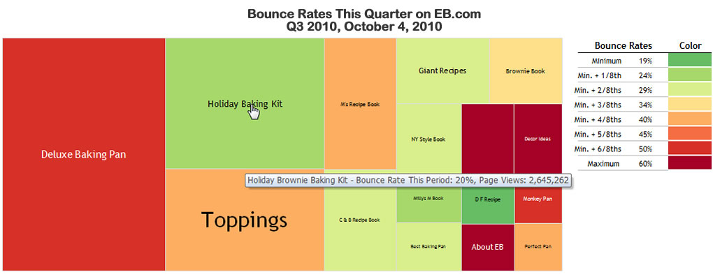
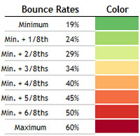
    To illustrate, take a look at Everything Brownies’ bounce rates on this brownie chart. The graphic shows all major pages of this fictitious site, and shows the pages as more red if they have the highest bounce rates relative to the others. You should know that size represents the relative numbers of page views. The bigger the “brownie piece,” the more views that page gets.

    What does this chart tell us? Quite a bit.

    The Holiday Brownie Baking Kit, which I placed my mouse over in this screen capture, has an excellent (i.e., low) bounce rate. It also has a ton of page views.

    That means this page is doing quite well in keeping visitors from leaving immediately. Well done! On the other hand, Deluxe Baking Pan is not nearly as successful. Its relative bounce rate is quite high, and because it has the most page views of the entire site, it’s clear this page is majorly dropping the ball!

    There are plenty more insights, but you get the picture.

    As I mentioned on Jason’s blog, what I like about this charting format is non-math types (such as myself!) can understand these statistics immediately, and know exactly what needs to be investigated further — and in what order of priority. As my friend Bob likes to say, “That’s good stuff!”

    I hope you find the potential of this charting technique as exciting at I do.

    A Round of Applause for BeGraphic and Sparklines for Excel

    This example of a fake report for EB.com, as well as the one on Social Media Explorer, was produced using an “Add-on” for Excel called BeGraphic. The Add-on consists of a whole suite of graphic tools — all based on Excel data and rendered within that application. The particular functions I used were part of Sparklines for Excel within the BeGraphic suite. I urge you to support the folks behind these amazing visualization tools.