Opinions are all my own

  • Four frivolous blogs for One Positive Day

    I interrupt this Labor Day holiday weekend with something totally frivolous. It’s the first day of the month, and in honor of Kevin Hillstrom’s One Positive Day concept I’d like to praise a group of people, instead of a single business or individual. Today, in this warm and sunny Midwestern Saturday, I’d like to tip a glass of something cold in the direction of the millions of people who’ve made the Internet richer by sharing their lives and their talents with the world.

    I write a professional blog, for purely professional reasons. I love it. I hope that comes through and takes some of the starch out of these posts. But there is always a level of propriety. The web may be freewheeling, but at least within these virtual office walls, I’ve placed limits on the topics covered and how they are discussed.

    Blogging For The Fun of It

    Most of the tens of millions of active bloggers have quite different standards and approaches. To my surprise, many are friends. I did a mental count yesterday, and realized that four of these friends who “blog for fun” were friends before they started blogging. (Full disclosure: One of them is more than just a friend. Hi, Julie. I’ll be home shortly — promise!)
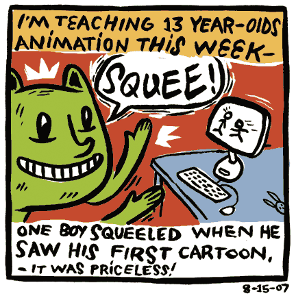
    A favorite of Max Estes’ blog so far

    And here, I’ve defined a friend in less the Friendster definition of a close connection on a profile, and more as a “real world” friend. In other words, I’ve shot the breeze with all of them, without a business connection or prior blogging relationship. Here are their blogs, listed from most recently founded to most established:

    1. My Life As A Bunny As I write this in a coffee shop, Max Estes is sitting at the neighboring table. His newly-launched daily blog (Wow! I can’t believe he’s so prolific!) is an absolute treat (example shown above). You may notice his style. He gave me permission to use a piece of his artwork to adorn the home page of this blog. I pray he wasn’t drawing me, but I’m too chicken to ask.
    2. Marty Feldmanize Me I’ve had the pleasure of knowing Augie for years. We first bonded over geek stuff, and the store for pet lovers he operates with his wife. And yes, we’re also professional colleagues. But I hope we’re friends first. Lately, his blog has shown me a new side to this complicated individual. Similar to the original Sienfeld show, I’d define this as a blog about nothing. I’ve enjoyed taking a break with it quite a bit.
    3. Bad Ass Birds The only blog in this list with a mildly vulgar title is also coincidentally the only one I would give a solid “G” rating, in terms of content and profanity. It amazes me how a mixture of made-up birds, odd reviews of even odder films, and semi-serious summaries of 1970s Dark Shadows TV episodes could add up to something so compelling. Man! As I look around, these bloggers are making me feel so boring!
    4. The Song In My Head Today This blog is lovingly written by a talented and passionate music reviewer (who also has excellent musical taste, in my humble opinion — she and I agree so often on her selections!). You’ll be challenged and entertained by Holly’s reviews. And God bless anyone who has on her blog an Elvis Costello Week!

    Could you think of a better time than now, during this sultry long weekend, to amble through some new and perfectly frivolous blogs? Go for it. Subscribe to the ones you like, and be sure to comment on them as you see fit. (Comments keep us bloggers from feeling like we’re wasting our breath!)

    And if any of your friends come to you and say, “I’m thinking of starting a blog,” tell them you know someone who has seen several of his friends — mostly non-tech types – take the plunge and revel in the world they found on the other side. Give your friend plenty of encouragement and watch what happens. It’s a blast for all involved.
  • Powerpoint to the people: A revolution in presentations

    On the last day before a holiday weekend, I thought I’d talk about something that’s important for us marketers but also fun. Or at least it should be. The topic of improving slideshow presentations has been covered wonderfully in the past, but there are some great new perspectives you should be checking out, to keep your Powerpoint decks in check.

    (With so many co-workers starting the holiday early today, one of the stalwart few who will be with me in the office today joked that he’d bring Mimosas. From that last riff you’d think he’d followed through on the threat!)

    Merlin Mann of 43 Folders gave a wonderful presentation to Google recently on better use of email. His 50 minute presentation (the video is below, and here’s a podcast of the talk) was as fun as it was practical. In response to inquiries, he shared his Powerpoint tips in a recent post. Although I should mention that he is the second person this week to let me know that Keynote has it over Powerpoint, if only because you can look at your speaking notes on your computer’s monitor while the audience sees the projected slide.

    In his tips on better slideshows, Merlin mentions Guy Kawasaki’s 10-20-30 Rule: “A PowerPoint presentation should have ten slides, last no more than twenty minutes, and contain no font smaller than thirty points.” This reminded me of another slideshow presentation form (I say form, just as poetry has its classic sonnet and haiku forms). I’m thinking of the form called pecha kucha.

    Pecha kucha was invented four years ago in Tokyo by Astrid Klein and Mark Dytham of Klein Dytham Architecture. They created it as a way to attract people to an event space they’d set up. They wanted a freeform presentation environment that wasn’t hackneyed. Sort of an un-poetry slam.

    Here are the rules for a Pecha Kucha night: A number of presenters (usually 14) each does a slideshow of exactly 20 images, each lasting exactly 20 seconds. That puts the total runtime at 6 minutes, 40 seconds. The topics of the presentation vary widely, but the presenters are primarily artists and designers. These events have spread, to take place in major cities around the world. I’m tempted to attend the next one in Chicago, in late September.

    According to an uncited entry in Wikipedia, this 20 slides, 20 seconds each form has been adopted in some corners of the business world. It allows for a brief, disciplined presentation of ideas, with questions withheld until the end and no room for meandering on the part of the speaker. It’s all in the service of avoiding “death by Powerpoint.” Those who know me well are aware that I dislike using Powerpoint, and try whenever possible to present with a simple MindManager mind map. Or just write out my ideas into a Word document (there, Microsoft, at least you get some of my loyalty!) and speak without visuals. It’s all in the worship of one of my business heros: Edward Tufte.

    For my friends reading this in the U.S., have a wonderful Labor Day Weekend, devoid of Powerpoint — unless you like that kind of thing!

  • Growth of out of home ads reflects our fragmented media consumption

    Physicists tell us the universe is ever-expanding, a concept that can make the mind reel. Advertisers trying to reach their target audience know this feeling well, as media alternatives continually fragment and multiply. One solution: Forget about media as we would ordinarily think about them and look to the places your market congregates as the medium itself.

    I’m only a recent convert to the power of out of home advertising, but that only seems to make me more of a zealot. Here are three examples worth filing away in your new media mental database:

    • Billboards that greet you by name — Tested last year and rolled out in the April of 2007, the Mini Cooper Motorby program is ingenious. Have owners register online, and receive a free key fob. When that key fob gets within 500 feet of a billboard, it triggers a personalized message. The billboard is 5 feet tall and 33 feet wide. My only questions: What are the results? And how are they translated to a true ROI?
    • Virtual billboards, Second Life-style — If an ad is on the side of a building, but that building is on Second Life, is that an interactive ad or out of home? A little of both, because it is far more interactive (try clicking through the side of a real building without getting injured or arrested), but has the same ambient quality of the real world. The biggest down-side: Ads are everywhere in Second Life.
    • Literally touch your consumers as they drink their coffee — Coffee cup sleeves have come of age. According to BriteVision, an industry leader in their production and distribution (they have their own ad network of coffee shops), the average consumer spends 49 minutes with their “Ad-Sleeve,” what an average recall of the ad at two-thirds (65%). The biggest up-side: Since many cafes offer WiFi, providing a URL can help measure effectiveness and reach an upscale segment of consumers. You can also include a phone number or short code for a mobile marketing play.

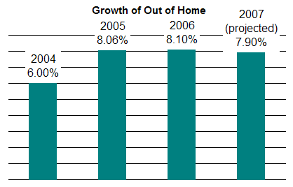
    The reach and creative potential with out of home are a couple of reasons it is growing when other media types are stagnant or shrinking. According to the OAAA, revenue for out-of-home advertising so far this year has increased by 7.9% (within a rounding error of the growth seen last year, and the year before). This projection for 2007 is based on spending in the first six months of the year. The graphic below shows prior growth.

    Growth of out of home this year is projected again at roughly 8 percent

    All of this is great news for brands that want to make a difference. There are many ways to truly involve consumers — some quite high tech, some that are extremely “out there,” and some that are frankly both. It all makes for an interesting ride with plenty to see and do.

  • When is a Site Map also an FAQ page?

    When is a Frequently Asked Questions (FAQ) page the same as a page containing a map of the site? The answer is they’re always both FAQ pages.

    No one visits a site out of random curiosity. Everyone has an agenda. And ideally, both the navigation of a site (as manifested in the site map) and the FAQ page address these user agendas.

    Every link of a site map promises an answer. Every section of a site is another category of frequently asked questions.

    The Takeaway:

    Ideally, an information architect is responsible for designing a site’s map. Conversely, content managers working closest to the customer should be responsible for maintaining the FAQ page, and the answers provided. These two functions should be talking to each other regularly to make both of their contributions the best that they can be.

  • Boost web conversions by greeting search engine visitors with unique content

    How often do you come across an account of the same new, breakthrough idea from two different sources within 24 hours? That happened to me this weekend, and even if I had just seen it once I would have found the idea extraordinary. First, I read how Offermatica provides a content management solution that helps with multivariate testing of offers and copy. From what is learned, customized content can be delivered in real-time, based on behaviors. Offermatica CEO Matt Roche describes a novel application of this tool in a MediaPost blog interview:

    [With the client site, MusicFriend.com] when someone comes to the home page [from a search engine] we know nothing about them, so they get the home page. What if we repeat the keyword that they searched on to get there, just show similar information? That increased the conversions. We repeat your keyword so you have a connection. Then we install affinity targeting that says when you go to the drums section and come back to the home page it will show you more drum offers. It increased the conversion rate in double digits on all the categories where we did category affinity.

    The emphasis was my own. Double digit conversions?!? What a great trick.

    Then I read Todd Friesen’s piece describing the same technique, in the July, 2007, print edition of Online Media, Marketing and Advertising (OMMA — and yes, it’s also a MediaPost publication). Phrased a different way, it suggests the same brilliant strategy:

    … Did you ever notice how most brand traffic lands on your home page? Even product terms that contain branded verbiage often get a home page ranking ahead of a product page. Most home pages are pretty generic and usually run creative speaking to a straight brand message or weekly deal. How do you refine that on the fly to positively impact conversion? With a good multivariate tool, it’s relatively simple.

    Some tools have the ability to recognize a search engine referral and identify the search term to define the creative displayed in the marketing modules on the home page. SEO managers then populate the “hero image” with a product related to the search and then load the complimentary products into the secondary marketing modules.

    It is standard practice to do something like this with pay-per-click ads. We create customized landing pages that repeat the keyword phrase used in the search. This idea extends that landing page mentality to organic search results.

    There is conjecture that the radio was invented in several places around the world at the same time. I suspect there will be similar arguments as to whom originated this simple and elegant way to improve the user experience for people arriving from search engines. All I can say is, I’ll glad I learned about it at all, so I can begin testing it with some of my clients.

    Any readers who are already using this technique?