Three lessons from my 15 years on Twitter

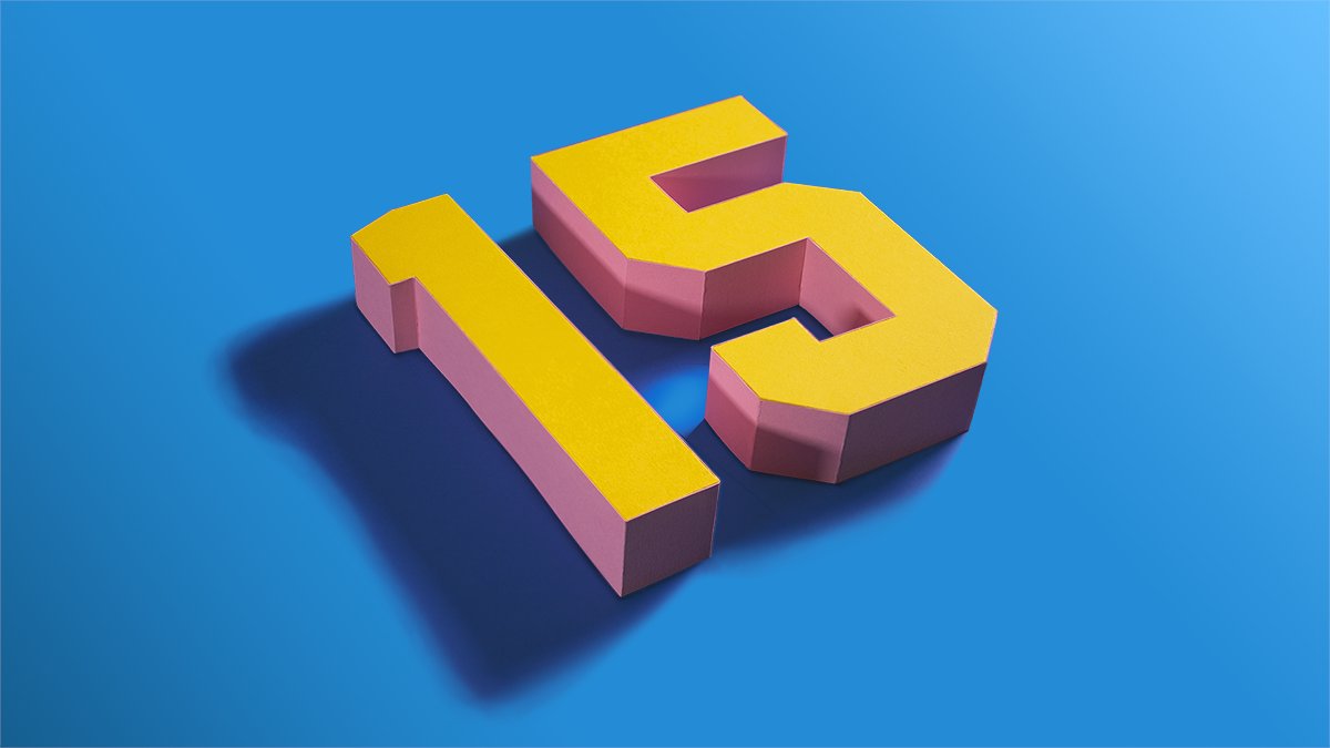
Today is my 15th year on Twitter. The medium has changed a lot over the years. More importantly, it has changed me. And society. Here are my thoughts.

1. Twitter’s history has been a dance between innovative users and its sometimes canny developers

The above post on this blog was from its very early days. Twitter was born of SMS, that 140-character text capability that was a biproduct of cell service. The character limit wasn’t alone in suppressing adoption. So was the fact that early cell phones, pre-cell-based-broadband, actually charged you once your texts exceeded a certain monthly maximum.

I was new enough on the platform, following pitifully few people and being followed by fewer, that this never phased me. But it was a problem for danah boyd. She is was anthropologist studying (at the time) youth and technology, before she left academia to work and publish at Microsoft Research.

boyd’s thoughts on the new technology called Twitter, which she encountered full-on at the 2007 South-by-Southwest, could be summed up in her blog post’s lead: “SXSW has come and gone and my phone might never recover. … To the best that i can tell, i received something like 3000 Tweets during the few days i was in Austin. My phone was constantly hitting its 100 message cap and i spent more time trying to delete messages than reading them.” (danah admitted at the time she was under the heavy sway of ani difranco, and her capitalization habits reflected it and still do.)

Twitter’s developers solved this problem within the year, by developing an app-based approach to following and reading tweets. But other innovations came from the users themselves, notably the invention of the hashtag. It was proposed by Chris Messina, late in the summer of 2007:

Adoption spread quickly, and soon Twitter had built an easy search mechanism for hashtags that we all take for granted.

2. Twitter has fostered grassroots revolutions and community-based journalism

I feel privileged to have witnessed history as it unfolded. One example is the Arab Spring of 2010-12, where, especially in Egypt and Tunisia, Twitter and Facebook helped to organize protests and, in cases such as Libya, take down dictatorial regimes.

Closer to home, I recall following the updates about the pursuit of the Boston Marathon bombing suspects nine years ago from two screens: My television, tuned to CNN, and my cell phone. As reporters on the ground, and copters circling the neighborhood where the bombers were hiding, were frantically speculating where they could have disappeared to, people I followed on Twitter were already, correctly, speculating they were hiding under the storage tarp of a boat parked in a driveway.

3. Forging friendships and business associations I never could have had

Especially since I quit Facebook, in light of the company’s egregious disregard for member privacy and spreading of fake news, Twitter has been my primary social media app for deepening some friendships and forging new one. Especially when I return to my old stomping grounds in Milwaukee, I often connect with people I have gotten to know on the platform extremely well. Twitter friends only, it’s been fun to meet them IRL.

I’m reminded that “adulting” often gets in the way of making new friends. Twitter has helped me in that important aspect of happy adulthood (and helped me familiarized myself with a ton of coinages such as IRL and adulting!).

Where from here?

These are the three bright spots on what could be a condemnation of social media. But I’m not Pollyanna. I am reminded daily of how Twitter has contributed to the disassembly of professional journalism and proliferation of filter bubbles, leading to no shared community or belief in things that are unquestionably true.

But what strikes me today, on the very day I first registered on the platform, is how much Twitter has contributed to my life, and the course of technological, social and geopolitical history.

Apollo was the god of prophecy. His namesake is a digital insights time machine

Adam Greco has been doing digital analytics implementations since before Adobe bought Omniture (now Adobe Analytics). I go back nearly that far, and have religiously studied his blog posts on the topic. He’s saved me hours of work. So I was thrilled to talk to him the other day about a new product category invented by his latest employer Search Discovery: Apollo, an Analytics Management System. I’m impressed, but I’ll be calling it a Digital Insights Time Machine.

Here’s why:

Excellent Digital Governance

If you’ve been in my shoes, and Adam’s, you know the trouble an organization can get into if it doesn’t have buttoned-up digital governance. Like when an enterprise lacks a clear insights generation strategy.

You see, that strategy describes business goals and objectives. and from them, predicts the reports that will be needed. This measurement strategy answers the question, What user behaviors are needed to achieve our business goals? Many organizations skip this step, and go right to implementation … Often trusting analytics team members with little understanding of business (!). This leaves these implementation pros having to make a best guess at what reports the enterprise will need down the road.

Imagine you’re someone responsible for an implementation of Adobe Analytics, and the chat window lights up with a request from your boss’s boss. Or boss’s boss’s boss. “Can we get a report on XYZ?”

When there is excellent digital governance in place. the answer you give is almost certainly Yes. But if you don’t, you’re faced with telling someone in control of your career that the report requires metrics that are not currently measured. Worse, the implementation will take weeks or even months because a change to the digital analytics data layer will be needed, and IT has many hotter priorities.

If you’ve faced this moment of white hot panic, you probably have wished you could climb into a time machine and make sure those metrics get implemented out of the gate.

Apollo is that time machine.

The first thing you’ll see, if you get a demo like the one Adam showed me, is Apollo’s best practice library of business requirements, for reporting and insight generation.

The list is vast, literally hundreds of requirements.

Search Discovery — relying in part on Adam’s deep experience with clients in every industry — have provided building blocks for any type or hybrid of online business . From these business requirements flows all of the metrics and dimensions that will be needed to address them in reporting.

Then things get really interesting

This shows part of the flow that is followed as you set up your Apollo instance:

Everything following out of the Business Goals and Objectives of this Measurement Strategy value tree is prompted from you by Apollo. Keep in mind that I’ve avoided arrows in the graphic, that would typically connect boxes from one column to the next, but as you likely have guessed, there is a one-to-many relationship flowing from left to right, with all the relationships being contained and documented within the Solution Design Resource (SDR).

If you state a requirement such as “I want to report how many orders are placed each day, week, month, etc.,” you select that requirement as needed and Apollo automatically adds all of the variables, data layer objects, tagging, etc., that you’ll need to track within the SDR.

More about that SDR: Unlike all of the SDRs I’ve ever encountered, the one in Apollo is part of its relational database. That means it can be exported to Excel if you feel inclined, but lives as a dynamic document that revises itself every time you make a change to requirements, metrics or reports.

So when you join an organization using Apollo, you never have to encounter all of the lapses and omissions that come from an SDR that is only half-heartedly updated as an Excel file (often in several versions, causing you to wonder which contains the most “honest” implementation snapshot!).

Leveraging APIs to Adobe Analytics, Launch, and even Workspace

How does Apollo populate your instance of Launch? It’s connected via API to your instance of of both Adobe Analytics and Launch. Since it adds Launch tags, all that’s left is for you to do is refine its work and begin the testing.

And because most implementations require IT to install or update the data layer, Apollo auto-generates the JSON code for that data layer. This makes the work of IT easier, improving the odds of speedy deployment.

Finally, Apollo helps you at least two ways to debug the implementation once it is deployed. It uses those API connections to identify errors, and pushes to Adobe Workspace the reports that can make visual review of the data easier.

Speaking of Workspace, all of the reports that are specified in this digital analytics “time machine” are pushed there, so all you’ll have to do is review and refine them.

Apollo has impressed me so much that I can’t wait to get my hands on the working system, for my first client to use it. If you’re also intrigued, contact Adam for a demo. Like me, you’ll get a glimpse into the future of our industry, where we can spend more time on strategy and insight generation, and less on wrangling code and change requests.

How to lie with data visualizations, Part 2

This is a follow-up to my post from last month. In that Part 1, I wrote about how shifting the ranges for heat maps and starting bar charts at numbers greater than zero can deceive. In this installment, I want to introduce you to the greatest source of lies in data visualization: Cognitive biases of their authors.

I started my earlier post with an example torn from the headlines. I will again below.

If you follow the latest news in the U.S. about Covid, you may have seen this graphic shared over the weekend, included as evidence for emergency approval of convalescent plasma as a treatment for the infection. The evidence was provided by FDA Commissioner Stephen Hahn. His chief graphic is shown in the above image.

The graphic  appears to show a 37% reduction in deaths for Covid patients receiving infused plasma from donors who have survived the infection. Famously, Tom Hanks and his wife donated their plasma to help the research being conducted world-wide.

Rounding down to 35% in a press conference, “A 35 percent improvement in survival is a pretty substantial clinical benefit.”

It is, but that isn’t what the data shows.

After an outcry from what seemed like just about everyone in Covid research whose name was not Stephen Hahn, he apologized. The drop in mortality was from roughly 11% to 7%, which is a drop of somewhere around 4%, not 37%. It was also from research on a small sample size, weirdly without a control group, among many other concerning factors.

In an administration that is arguably more politicized than any in recent history, the impulse is to say this U.S. government official lied. Strictly speaking, he most certainly did — in both his words and his supporting data visualization. But the motivation could be less nefarious — or at least, more common.

Cognitive Biases Can Make Us Lie to Ourselves

Our brains are not the perfect instruments we delude ourselves into believing. Consider the Free Brian Williams episode of Malcolm Gladwell’s podcast Revisionist History about the fallibility of human memory. Or more relevant to this instance of (self-)deception, consider this roughly 10-minute excerpt of a talk I co-presented in 2018 at Adobe Summit in Las Vegas. In that talk I explain why clear, data-focused hypotheses are an important protection a data scientist has against cherry-picking or distorting data to pronounce a test a winner.

In that talk I explained that we as marketers exploit consumer cognitive biases every day, including through the use of A/B testing tools like Adobe Target. That’s a good thing, from a marketing perspective. I also maintain that there is strong evidence all of us, regardless of our training and discipline, probably have biases that literally pre-date us as humans. These biases can cause us to lie to ourselves, and through those self-deceptions, lie to our clients.

Everyone wants to report successes. But science is hard, and replication of test results is a persistent problem. In addition to clear hypotheses, we can also conduct an exercise called preregistration to save us from ourselves.

The Killer of Truth Is Calling From INSIDE THE HOUSE!

In my first installment I talked about how easy it is to distort numbers by using bad or lazy visualizations. In this second and last installment, I want to remind you that a far more pernicious murderer of the truth is your own best intentions. I’m willing to give Mr. Hahn the benefit of the doubt that he wasn’t so much lying as practicing wishful thinking, which blinded him from many clear contraindicators of his conclusion — including the fact that randomized trials of convalescent plasma at scale is dead simple to conduct. They’re indeed being done elsewhere in the U.S., such as at UCLA — where Tom Hanks donated his plasma — and in other countries around the world. Yet no country has rung the bell on such a decisive victory over this horrible virus.

Let his humiliation be a lesson to us all.

Build a Google Analytics campaign spreadsheet that also crafts the links!

Dorcas Alexander wrote on the Luna Metrics blog recently about an important and often-overlooked topic: Organizing the campaign information you can gather in Google Analytics. I’m following up here with a way to document your campaigns. This method also solves the problem of constructing the special URLs used to create those campaigns in the first place.

If that seems a little opaque to you, read on. I suggest you start with this excerpt of Dorcas’ post:

It’s so easy to tag your campaigns for Google Analytics that you can quickly fill your reports with a mishmash of labels and end up with campaign tag soup! But what’s the best way to get organized? Even if you know what medium and source mean, it’s not always obvious how you should fit campaign info into those slots. And what about the extra slots we get for campaign tags like campaign and content and term?

It goes on to list four simple steps to preventing confusion. The fourth discusses documenting your work. It recommends how — by setting up a Google Docs spreadsheet, which can be shared among all content or analytics team members. He goes on to say, “Another good thing about using a spreadsheet is that a formula can pull all your labels together into a campaign-tagged URL.”

That’s a great idea, but how exactly can this be done?

Here’s my how-to, an addendum to that Luna Metrics post.

Above is the Google Spreadsheet I created for a former client (I needed to stop working with them when I joined Accenture). I’ve replaced the live information they were using with some of my own, to protect confidentiality. I’ll assume you already know how to set up a free Google Docs account, which includes the use of their cloud-based Excel competitor, named Spreadsheet.

  1. Create five columns: Output URL, Target URL, Formula, Campaign, Source and Medium. But wait!, you say. Where is that third column? It’s the Formula column, and is hidden here. I hid it because, a.) It looks identical to Output URL when you have live data in there, so it was redundant, and b.) I prefer to keep it hidden because each cell of that column contains the same formula — one that you definitely don’t want to accidentally change or delete. If I were setting up the system in Excel, I’d make those cells protected.
  2. Before “hiding” column C, place this formula in it: =((((((((B2&IF(ISERROR(FIND(CHAR(63),B2,1)),"?","&"))&"utm_campaign=")&D7)&"&utm_source=")&E2)&"&utm_medium=")&F2)) This formula confirms that the target URL (in cell B2) does not already contain a question mark in it. If it finds one already, none will be added. If it finds no question mark, it added one. After that it builds a trailing URL string that will be familiar to those who roll their own URLs, or use Google’s URL Builder. Once you’re done you’re safe to highlight the column and hide it.
  3. In the Output URL column, place a far smaller formula: =C2 Yes, that’s all. Just display the contents of the hidden cell C2 in the visible cell B2.
  4. Populate the Target URL cell in that row with the web address of the landing page you want to tag with campaign information.
  5. Finally, fill in the Campaign field, along with the Source and Medium fields. These are the unique names of the campaign you wish to credit that visit to, along with the web site or social app it was came from (e.g., Twitter, or Jason Falls’ Social Medial Explorer blog), and the general medium (e.g. social, or web).

That’s it! In the Output URL you’ll find the line. Copy it, and paste it wherever you are setting up a hyperlink on another site or digital channel. For example, that top line shows the URL I used when I was Tweeting about my recent blog post extolling the new release of an Excellent Analytics upgrade.

In the rows to the right of those I’ve shown, you can make notes about when it was used, why, and how you promoted the link. All of this can be helpful when you pull the campaign, source and media statistics for analysis.

I hope this helps. Let me know what improvements you might have experienced in how to catalog your campaign information.

Excellent Analytics 1.1.5 Update Announced

If you’ve been following my web analytics work, you know that I’m a major fan of Excellent Analytics. I have news. There has been a major (and much-needed, considering the changes by Google Analytics API), of their terrific Excel Add-on. Here are a few of the improvements and additions, as listed in the announcement of the Excellent Analytics update:

  • All dimensions and metrics are up to date. I.e. everything made available to the API should be included in EA.
  • A new tab in the menu bar, “Settings” has been added. You can access proxy settings at any time if you’re using a proxy and need to enter your settings. Before it only popped up when it seemed to be needed. In the settings dialog you can also find “Request timeout”, increase this figure if you have problems logging in. “Update metrics” and “Update dimensions” will make it easier for us to make sure you always will be able to access new metrics and dimensions as Google add them to the API. Before we needed to make a new release of EA for every update.
  • You can choose to save your password locally on your computer if you do not want to enter it every time you open Excel. It won’t be stored in clear text. We do not store your password anywhere for you. It’s only stored on your computer. If you don’t want your password stored at all, just don’t check “Remember password.”
  • EA checks for updates every time you use it. If there is a newer version of EA you’ll be prompted to download it. You can also ask to be reminded again later.
  • Improved user interface. Some things like sorting and profile selection have been moved.
  • Make a query and run it for multiple profiles at once! Before you could only create a query for one profile at a time. Note that you, however, when you want to update data per profile, have to do one update per profile. It’s for that initial creation that you can run one query for multiple profiles. This makes creating your report templates easier.
  • Multiple level sorting of data. I.e., you are able to sort by descending x and then by ascending y, etc.

This application is, for the moment, free and open-source. It’s a valuable web analytics resource!