Regular readers know I’m a fan of the work of Edward Tufte, who the New York Times once described as The da Vinci of Data. The unifying theme of his many books and papers is finding ways to make complicated data simple and immediately understandable.
This is rarely easy. That’s why there is so much data presented in less than ideal graphical formats. Difficult-to-process-tables are one of the contributors to the Death By Powerpoint syndrome.
Is boring your audience a crime? No. But especially in an era where so much is changing so fast, the need for nearly instant understanding is even more important. There must be understanding of the facts before the right decisions can be made. Obviously, companies whose people make decisions based on what’s really happening have a significant competitive advantage.
Reshaping How Information Is Shown
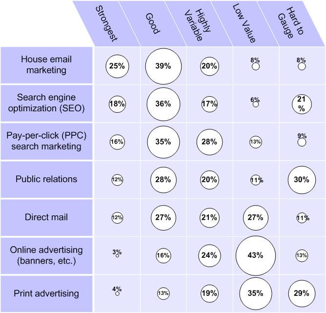
I was reminded of this when I looked over an old post, Survey of marketing tech types finds ROI strongest for search and internal email tactics. Its source was this table of survey information, from eMarketer:
 Consider this the “Before” example, to be compared with the image below.
I found the insights in these survey results interesting and occasionally downright provocative. (You can click on the link above to read the observations that I thought were worth discussing.)
My problem: For me, at least, pulling insights from a table of percentages alone was nothing short of agonizing.
My solution was to convert it into this:
The Same Data Made More Understandable
Below is what I came up with (click for a slightly clearer version). After looking for other types of charting, I realized that the benefits of the table (many different comparisons can be made) could be combined with the benefits of a bubble graph (intuitive comparison of visual “volume”).
I don’t pretend to be a charting innovator, but instead present this as encouragement. If I can improve data using a simple graphics program (I used Visio), so can you.