How to lie with data visualizations, Part 1

The last time our world experienced a virus of Covid-19 lethality, our public discourse was not that different than today’s. Of course I’m talking about the 1918 Spanish Flu. Even its name is a lie. It was called that in U.S. newspapers not because Spain was the origin of the virus but because Spain was a neutral party in World War I, which was blazing at the time.

How’s that, you say? While other countries embroiled in the conflict didn’t want to spook their citizens back home by honestly assessing the toll the deadly flu was taking on their troops, Spain was more forthright. More than most countries, Spain even took precautions such as strict quarantining and social distancing.

Following the dictum that no good deed goes unpunished, Spain got to “own” the flu appellation in the U.S. press because of those actions, in a xenophobic slight not unlike the way French fries — as beloved during the time of our multi-country occupation of Iraq as they are today — became known for a time as “freedom fries.” Why? France did not choose to join our little alliance. And we all know how successful that nation-building adventure was.

It makes you wonder when we will start paying attention to what our European neighbors are thinking. They occasionally may be onto something.

Hey, we’ve got this!

So what has this got to do with data visualizations? Just that powerful systems often try to deceive as a way to hold onto power. This can involve the systems disclosing data they possess to their constituents in a way that assures the inattentive Hey, we’ve got this! I’m going to show you an example from my recent work, but first, let me show you the data visualization pants-on-fire deception that got me typing in my basement instead of enjoying this sunny Saturday afternoon ..

This is a set of charts — one from July 2, and the other from today, July 18. In those two weeks, can you spot the 50% increase in cases per thousand? (I verified today’s number on the Georgia Department of Health website just now, and confirmed the July 2 screencap is legit as well).

Made more infuriating when you realize human lives are at stake, the graphic is right below this statement: “The charts below presents [sic] the number of newly confirmed COVID-19 cases over time. This chart is meant to aid understanding whether the outbreak is growing, leveling off, or declining and can help to guide the COVID-19 response.”

Okay, quiz time: Can you spot the increase in this before-and-after map?

Map before

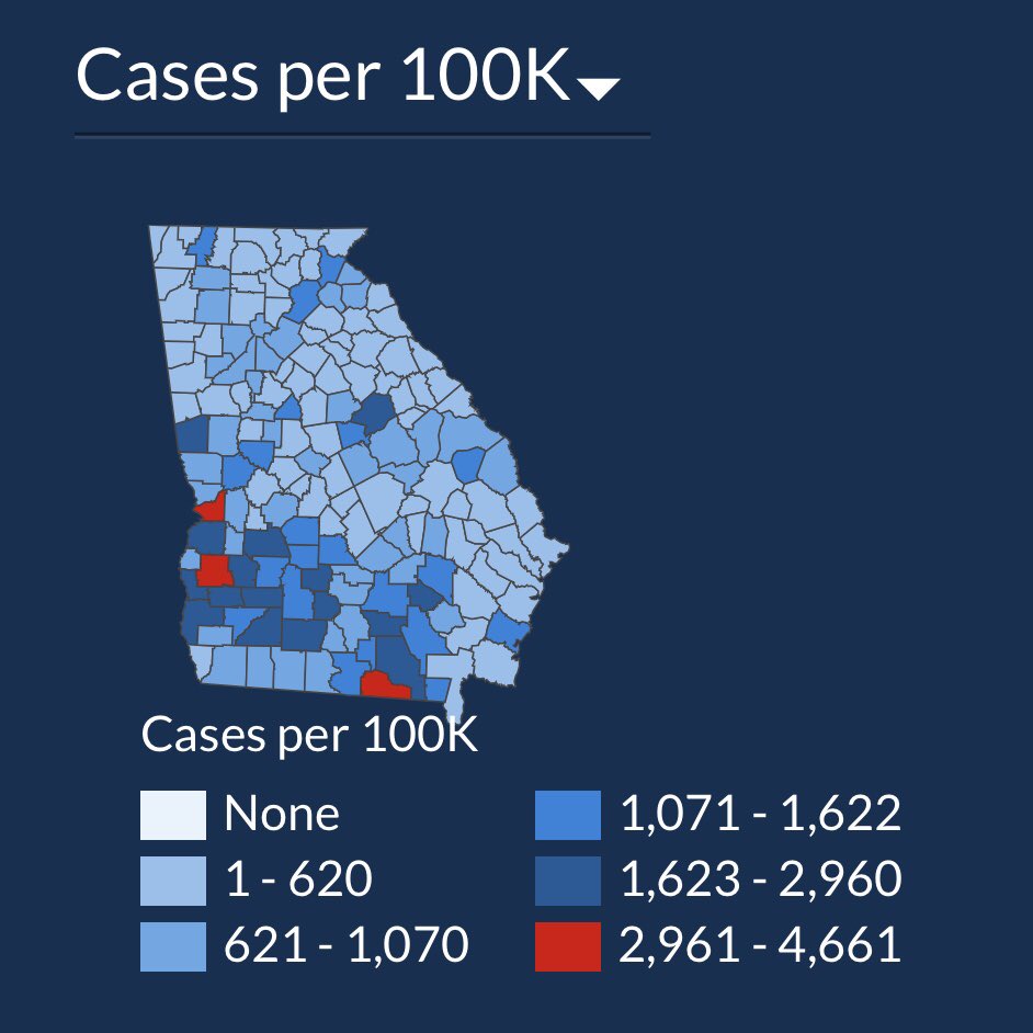
If you haven’t caught it yet, I’ll give you the explanation that @andishehnouraee provided: “[Georgia Governor Brian] Kemp’s health department keeps changing the numbers on the map’s color legend to keep counties from getting darker blue or red. 2,961 cases was Red on July 2. Now a county needs 3,769 cases to show red. The result: an infographic that hides data instead of showing it.”

I find this indefensible. I will say other graphics on the same page definitely show a spike. But if I’m a Georgian and I look for my county on the only map on the page, how am I to know that my community has half again more confirmed cases than it did two weeks ago? This data visualization “shell game” may persuade inattentive citizens of a given county to not social distance, or wear a mask in public, and thereby cause further infection in an actual, honest-to-goodness public health crisis.

[Some Redditors have said these maps were designed to show county-to-county differences, but I’m not buying it. When you choose a color scale, either keep the numbers the same for the colors or don’t use numbers at all, and show percentages. The typical citizen isn’t going to spend more than a few seconds looking at the map, and will get the wrong story from this one.]

How to deceive using shifting scales, with Excel as your accomplice!

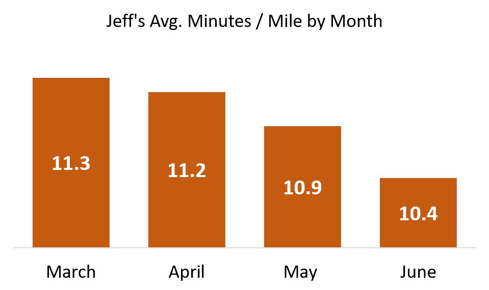
The above is an example of: If you don’t like the data, change the base numbers. Another, more common way is to not clearly show your bar charts or line charts starting from zero where the axes meet. Let’s say I am trying to improve my abysmal running pace, and share my progress with the world (These are real numbers, but give me a break … I’m an old nerd, not an elite runner!):

Look at this glorious chart! I can hear you exclaiming: What progress you’ve made, Jeff! But is it really that impressive? Of course not! When I popped these numbers into Excel and hit Insert Bar Chart, Excel did some editorializing. It started my Y-axis at 9.8 minutes per mile. And in doing so, it made me look like to the inattentive as though I’ve halved my time since March!

Let me repeat: Excel did this handicapping of my pathetic times automatically.

To get a real world view of my running — a world which includes rare athletes who have completed  marathons at far less than half my personal best — here is the same graphic when the bars start at zero minutes per mile:

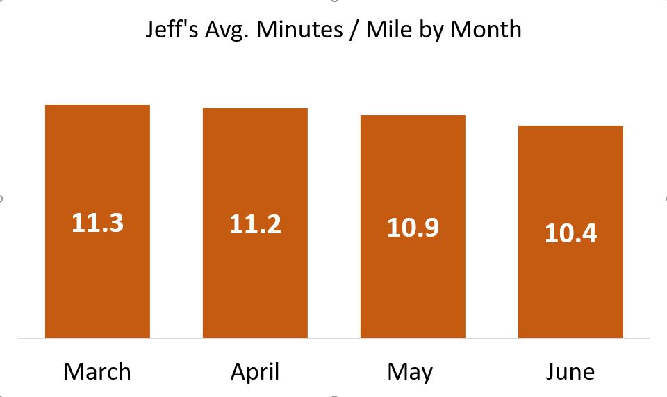
Not nearly the ego-boost, but it’s honest!

Scale breaks to the rescue

What if you just don’t have the room for all of that athletic plodding? In other words, what if my sad pace just wouldn’t fit on the slide, the bars being too tall? Yes, that’s a real thing, as I’ve pointed out in data visualization lectures:

Sometimes you want to take your audience all the way to the treetops, where the trunks are invisible but you can see which are the tallest of the majestic redwoods.

There’s this thing called a scale break  (shown below with a made-up data set):

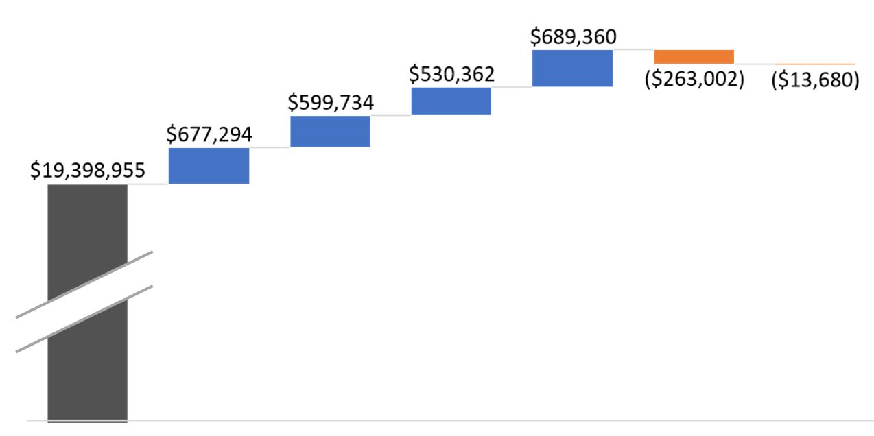
Now you can see a chart that tells an honest story without messing up the scale of your slide. And you can focus your audience’s attention on the data that matters.

Watch this blog for a follow-up, with more tips on how to lie with data visualizations!

Build a Google Analytics campaign spreadsheet that also crafts the links!

Dorcas Alexander wrote on the Luna Metrics blog recently about an important and often-overlooked topic: Organizing the campaign information you can gather in Google Analytics. I’m following up here with a way to document your campaigns. This method also solves the problem of constructing the special URLs used to create those campaigns in the first place.

If that seems a little opaque to you, read on. I suggest you start with this excerpt of Dorcas’ post:

It’s so easy to tag your campaigns for Google Analytics that you can quickly fill your reports with a mishmash of labels and end up with campaign tag soup! But what’s the best way to get organized? Even if you know what medium and source mean, it’s not always obvious how you should fit campaign info into those slots. And what about the extra slots we get for campaign tags like campaign and content and term?

It goes on to list four simple steps to preventing confusion. The fourth discusses documenting your work. It recommends how — by setting up a Google Docs spreadsheet, which can be shared among all content or analytics team members. He goes on to say, “Another good thing about using a spreadsheet is that a formula can pull all your labels together into a campaign-tagged URL.”

That’s a great idea, but how exactly can this be done?

Here’s my how-to, an addendum to that Luna Metrics post.

Above is the Google Spreadsheet I created for a former client (I needed to stop working with them when I joined Accenture). I’ve replaced the live information they were using with some of my own, to protect confidentiality. I’ll assume you already know how to set up a free Google Docs account, which includes the use of their cloud-based Excel competitor, named Spreadsheet.

  1. Create five columns: Output URL, Target URL, Formula, Campaign, Source and Medium. But wait!, you say. Where is that third column? It’s the Formula column, and is hidden here. I hid it because, a.) It looks identical to Output URL when you have live data in there, so it was redundant, and b.) I prefer to keep it hidden because each cell of that column contains the same formula — one that you definitely don’t want to accidentally change or delete. If I were setting up the system in Excel, I’d make those cells protected.
  2. Before “hiding” column C, place this formula in it: =((((((((B2&IF(ISERROR(FIND(CHAR(63),B2,1)),"?","&"))&"utm_campaign=")&D7)&"&utm_source=")&E2)&"&utm_medium=")&F2)) This formula confirms that the target URL (in cell B2) does not already contain a question mark in it. If it finds one already, none will be added. If it finds no question mark, it added one. After that it builds a trailing URL string that will be familiar to those who roll their own URLs, or use Google’s URL Builder. Once you’re done you’re safe to highlight the column and hide it.
  3. In the Output URL column, place a far smaller formula: =C2 Yes, that’s all. Just display the contents of the hidden cell C2 in the visible cell B2.
  4. Populate the Target URL cell in that row with the web address of the landing page you want to tag with campaign information.
  5. Finally, fill in the Campaign field, along with the Source and Medium fields. These are the unique names of the campaign you wish to credit that visit to, along with the web site or social app it was came from (e.g., Twitter, or Jason Falls’ Social Medial Explorer blog), and the general medium (e.g. social, or web).

That’s it! In the Output URL you’ll find the line. Copy it, and paste it wherever you are setting up a hyperlink on another site or digital channel. For example, that top line shows the URL I used when I was Tweeting about my recent blog post extolling the new release of an Excellent Analytics upgrade.

In the rows to the right of those I’ve shown, you can make notes about when it was used, why, and how you promoted the link. All of this can be helpful when you pull the campaign, source and media statistics for analysis.

I hope this helps. Let me know what improvements you might have experienced in how to catalog your campaign information.

Excellent Analytics 1.1.5 Update Announced

If you’ve been following my web analytics work, you know that I’m a major fan of Excellent Analytics. I have news. There has been a major (and much-needed, considering the changes by Google Analytics API), of their terrific Excel Add-on. Here are a few of the improvements and additions, as listed in the announcement of the Excellent Analytics update:

  • All dimensions and metrics are up to date. I.e. everything made available to the API should be included in EA.
  • A new tab in the menu bar, “Settings” has been added. You can access proxy settings at any time if you’re using a proxy and need to enter your settings. Before it only popped up when it seemed to be needed. In the settings dialog you can also find “Request timeout”, increase this figure if you have problems logging in. “Update metrics” and “Update dimensions” will make it easier for us to make sure you always will be able to access new metrics and dimensions as Google add them to the API. Before we needed to make a new release of EA for every update.
  • You can choose to save your password locally on your computer if you do not want to enter it every time you open Excel. It won’t be stored in clear text. We do not store your password anywhere for you. It’s only stored on your computer. If you don’t want your password stored at all, just don’t check “Remember password.”
  • EA checks for updates every time you use it. If there is a newer version of EA you’ll be prompted to download it. You can also ask to be reminded again later.
  • Improved user interface. Some things like sorting and profile selection have been moved.
  • Make a query and run it for multiple profiles at once! Before you could only create a query for one profile at a time. Note that you, however, when you want to update data per profile, have to do one update per profile. It’s for that initial creation that you can run one query for multiple profiles. This makes creating your report templates easier.
  • Multiple level sorting of data. I.e., you are able to sort by descending x and then by ascending y, etc.

This application is, for the moment, free and open-source. It’s a valuable web analytics resource!

3-D Printing: Because Atoms Are A Drag

Twenty years ago the consumer tech magazine to read was PC/Computing. This, in spite of its stupid name. (Spell it out: “Personal Computing Computing.”) I recall an ad from its back pages for some long-forgotten software. Buy the software and you’d get a bonus bumper sticker, reading: In the future everything will work. Those were the days of crappy dial-up modems and the crash-prone Windows 3.1, so this was high sarcasm.

In honor of the upcoming Rock the Green music festival, to be held on Milwaukee’s lakefront September 18, I submit this similarly absurd proclamation: Technology will fix our planet. What’s more, I assert that your guffaws (yes, I can hear them now) is in fact further evidence of its certitude. Here’s how:

Yes, a chain mail glove, produced by Within Technologies. It represents an amazing technology; one that uses one-tenth the metal of conventional manufacturing and arguably just as little fossil fuel. What’s more, there isn’t a single seam or joint in the whole works. It was manufactured by a printer.

Alexander Bell’s Telephonic Folly

In the future we’ll be printing things, not just pictures or descriptions of things. Things made of metal, fiber, just about any material. This printing will take place well beyond the factory floor. It will happen in the back of auto repair shops, clothing stores, hobby shops. Out of the nozzles of printers will issue the very supplies and inventory of future commerce. Someday we may even be printing our own “stuff,” right in our home.

This will save huge amounts of fuel. Needless to say, that will spare our planet from megatons of pollutants annually. And yes, I know I’m sounding all PC Computing. But contrary to the bumper sticker, I know these printers won’t work perfectly. Nothing ever does. There will be problems. But it won’t matter. The technology will arrive, whether we invite it into our lives or not. And if his particular revolution won’t take place, I’m confident another will . It will be just as extraordinary. I blogged about that one other tech revolution: Not printing things in three dimensions but the very food we eat, using living cattle, pig or chicken cells instead of metals and plastics. Yes, printing T-bone steaks.

I base my confidence — my optimism — on history. The world is full of smart people. Always has been. But we have a massive blind spot for the reality of our lives in the future because we’re limited by our imaginations.

Take the telephone. The phone has been a tool of almost universal good, aiding both business and society. It has saved lives (think: Dial 9-1-1) and saved massive transportation costs (as when you phoned ahead before driving to the store and discovering they’re sold out anyway).

I’ve written before about the phone, and how no one thought that technology would be much beyond a less precise telegram. Here’s an excerpt from that 2007 Business Journal post:

Executives in the telegraph industry couldn’t imagine that a device with no written record of the communication could be a threat to their business. In fact, legend has it that William Orton, the president of [the once mighty telegram company] Western Union … was offered a chance to buy Alexander Bell’s phone patent for $100,000. The story goes that he replied, “What use could this company make of an electric toy?”

The emphasis is mine, but you get the point.

I do suggest you click on this link to a post on my personal blog, about, of all things, growing meat in the lab. It’s another new technology that I think will be as revolutionary as the telephone.

To be fair, it’s not so much the technology that makes it revolutionary — this one uses in vitro lab culturing, which isn’t new — but the good it can do . It promises to feed the world, and in doing so conserve a staggering amount of natural resources and carbon-emitting fuels. I’m not kidding.

When they hear about culturing meat in a lab most people laugh or wince. I frankly don’t blame them. I may be a bit of a whack job to think this level of aversion can be overcome, but I do believe the writer of the New Yorker piece, who I cite in that post, when he says he expects to see it arrive, in at least a limited way, within ten years.

Read it, and I dare you to disagree. It’s that much of a game-changer.

Printing Chain Mail and Grandfather Clocks

Which brings me back to 3-D printers. They’ve actually been around for about 20 years. I saw my first one at my brother’s company, ten years ago. Originally used to print manufacturing prototypes, now they’re frequently being upgraded to manufacture the things themselves. Here’s an excerpt from a recent Economist story about them:

Far-fetched as this may seem, … people are using three-dimensional printing technology to create … medical implants, jewellery [sic], football boots designed for individual feet, lampshades, racing-car parts, solid-state batteries and customised [sic again — hey, they’re British] mobile phones. Some are even making mechanical devices.

At the Massachusetts Institute of Technology (MIT), Peter Schmitt, a PhD student, has been printing something that resembles the workings of a grandfather clock. It took him a few attempts to get right, but eventually he removed the plastic clock from a 3D printer, hung it on the wall and pulled down the counterweight. It started ticking.

Although the article focuses on the savings in raw materials (it takes only ten percent of the metal to make something complicated in this way, compared to the wasteful machining and whittling away of metal blocks), there are other clear implications for a greener planet.

It will happen when these 3-D printers become more affordable. Think about it: There was a time when only well-financed businesses could afford a fax machine. Time improved the technology and drove costs down. Now you can buy a fax machine for about fifty bucks.

What if these printers were to follow the same trajectory? At first only the largest businesses could afford to produce their own machine parts. Then smaller businesses could afford it. But they wouldn’t be faxing each other digitized pictures of documents. They’d be transmitting the digitized plans to actually make stuff.

Atoms Are A Drag

Jeff Jarvis famously said that the reason businesses like Amazon.com and Apple’s iTunes have prevailed over stores that sell real books and CDs is that moving atoms from place to place is costly. Digital transportation, by comparison, is frictionless. Atoms are a drag.

Imagine a world where the friction is taken out of moving real things around. Instead of the rotor to your car’s disk brakes arriving by truck at the repair shop, the part would arrive digitally, and perfectly configured to your vehicle. Or at least the plans for it would. Then a tiny pile of metal and composite powder, a small fraction of the size of what’s needed using today’s technology, would be fed into a 3-D printer. You’d be on the road more quickly, at a lower cost, and at a lower cost to the planet.

What do you think about a future where atoms are no longer a drag? Do we dare to dream of our grandkids inhabiting a world with more fresh water, less pollution and fewer pollution-borne illnesses?

I say we must.

Using Google Analytics’ New Report Dashboard

My work with Accenture has meant this blog has been silent since I joined. I’m loving my work there, by the way. But as for the central focus of this blog, I’ve been continuing to have fun in my off hours with web marketing analytics, especially using Google Analytics. If you use this app, you know they’ve launched a major upgrade of their reporting. It includes a way to create custom dashboards. Below you’ll find one small way I’ve used these new custom dashboards to save time and gain valuable insights.

Until I joined Accenture I was one of the contributors to Jason Fall’s exceptional social media marketing blog, Social Media Explorer. I miss being in such terrific company (they haven’t kicked me out of their Facebook group, something I’m very pleased about). I also miss those posts and the greater audience they had afforded me for my ideas on measuring social media.

But all was not well. I had always wondered how often people viewed my posts, the way I can with this blog. Yes, I could see which posts were the most likely to go viral. I could get that like anyone, from this summary of all of my posts there.

Then Jason shared with his contributors full reporting access to his Google Analytics metrics. Heaven!

Now I had a different problem: I could see aggregate information, but there was no easy way to view just the information about my pages. If the structure of the site had been, say, “domain.com/jefflarche/blogname,” I could view only the pages starting with /jefflarche/. That’s not the case, though. So I walked away, vowing to someday find a way to create a report that would give me a breakdown of my posts, at least for the KPI of Page Views. I got busy today by creating a new Dashboard for the profile. I then populated it with Widgets. Here you can see what the set up looks like for each widget I added (one per post):

Below are the steps taken in this form:

  1. I chose the widget called “Metric.” This shows one number only (along with a couple of others, for context), instead of a chart, a timeline or a table
  2. I chose the metric of Pageviews. But I needed to add a filter. For that, you can see I chose to only show the count for pages that contain a unique string. For this example, I chose the unique string social-media-awareness-measurement/ portion for this post’s URL
  3. I gave the widget the title of that post and linked to it so reviewing content for hints of popularity (or lack thereof!) would be easier

Pretty easy, no? Once I had added a widget for each, this is what I got:

So what insights can I glean from this? First of all, it took a while to build an audience. I learned as I went along, from the first post (lower right corner) to the latest (upper left). I knew this from other measures, which made it particularly sad for me to walk away from the posts. I saw a growth for 693 percent, comparing the views my first post got versus my last.

Turning Information Into Insights

Here are other insights:

  1. People love “how to” content, and respond to headlines that contain those magical words. (I knew this from my direct response days, but it’s cool how thoroughly this has been carried to the online world.)
  2. People like to read reviews of relevant books. That’s what I did with the extremely popular post Lessons from the Twitter Love Guru
  3. Sparklines can give valuable hints to user habits

This last one isn’t readily apparent. I’m going to assume you know what a sparkline is and just say that each of them above shows a sharp rise and fall in readership. After the week it has been posted you can see the view plateau very near zero. It’s to be expected. But there was an outlier, which you could only see if you viewed the full report. It’s shown above right.

Not only did this post not immediately “click” with readers (look at the leading tail), but once it did, its tail at the end is thicker, showing more ongoing popularity. If you’ve been a reader from the start, you’ve already read here and elsewhere about The Long Tail. Here it is in action!

This odd sparkline caused me to dig deeper, and I saw this report for all sources of visits to that page since it post (to the right).

It shows a significant number of links from referring sites and search engines. The referrers obviously liked the content enough to send their readers to it. And search engines? This is the ultimate long tail. I even got four visits from Google for the phrase “measure if people share your content on social media.” Believe it or not, this is hotly contested (I no longer show up for this phrase — at least in the top three pages).

By the way, “feed” stands for Feedburner, which means the fourth (or third, depending on how you look at it) source of visits is people who read Jason’s blog using an RSS reader.

As I said, it pays to be in cool company. By the way, here’s a shout-out to Argyle Social. They’re right near the top as a source for clicks to this page. Their latest post, Is Post Automation Effective? particularly fitting. I would say certainly say yes!

A Link To All of My Social Media Explorer Posts

If the headlines of the above got you curious about my content, I encourage you to visit this summary page, with links to all of them. I’ll be watching this new dashboard to see just how many of you do!