What do these three quotes have in common?
- “Worship no false idols” — The First Commandment in the Old Testament
- “If you meet the Buddha on the road, kill him” — Zen adage
- “Become a ruthless killing machine when it comes to metrics/data” — Avinash Kaushik in a recent blog post.
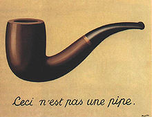
 If you guessed that they all warn (with increasing violence!) against mistaking the symbol of something for the real thing, congratulations! You won a pipe. Surrealist painter René Magritte painted this particular pipe as a way to get us thinking about the paradox of symbols. Under it he painted a caption, “This is not a pipe.”
To drive his point home, Magritte named the painting, The Treachery of Images.
So how can we know when it’s time to wage war against our own treacherous web analytics? And once the body count has been tallied, what takes their place? What do we use to answer key questions and spur appropriate actions?
Results Simply Summarized
The answer: Show your audience only what they really want to know — not mere numbers and measurements, but the other RSS: results simply summarized. Here’s Avinash’s post for the full story.
And here it is in a nutshell:
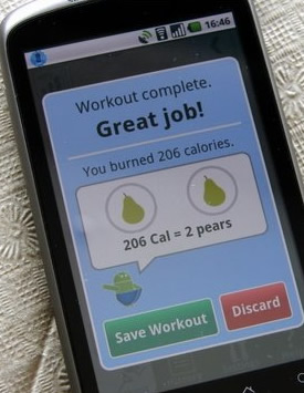
He describes a favorite application he downloaded for his Nexus One phone. It’s a cardio trainer. The app starts out just like another popular body monitoring system. I’m thinking of the Nike Plus application for the iPhone. Both give the standard run-down of miles run and progress achieved, compared with past sessions.
The cardio trainer app then makes an elegant attempt at RSS. Avinash, for one, feels that it succeeds. I agree. It refocuses attention past the numbers to the actual workout goal.
At the end of each run, to reflect his level of exertion, Avinash is presented with an award of sorts. The screen shows two pieces of fruit — two pairs. They represent the number of calories burned. The pairs are his to enjoy guilt-free. (Or he can imagine a calorie-laden equivalent, in a mental swap of one food for another. Perhaps the next version of the app will allow users to actually do this; To replace the outline of two pears with a rendering of a candy bar, or a couple of bottles of beer!)
 You might think these graphics are the same as Magritte’s pipe — mere symbols; not the real thing. You’d be overlooking a major distinction.
All Magritte was doing was showing the pipe. Avinash’s workout app was presenting the pears — awarding them. It was the summarization of the data behind it, proving to Avinash that this was his hard-won snack. It says, “Here you go. You earned it.”
Connecting On Two Levels
The representation of the pears became something he could connect with — both rationally and emotionally. Unlike Magritte’s pipe, the pears are results, supported by evidence. Consequently, for the recipient, they become so real that person could almost taste them!
Sadly, if most analytics pros were asked to cut out their own distracting and unpersuasive metrics, little would be left. Most metrics talk and talk but never get to the point.
This is precisely what senior management does not want. They want quick and truthful take-aways. Will they be dining on one delicious pear this month, or two? Or will there be none at all?
Of course business leaders wouldn’t want to see pears in their analytics. That would be absurd. So what do they care about? They want to see money of course. Or at least, clear proxies for money. Showing images of people is always good, since selling things to people is the surest path to making money. With that in mind, consider using generic silhouettes of them, shown judiciously, and with data that supports their numbers on the page.
Be bold. Show senior management that their site generated more sales leads this month — as represented by silhouettes of cookie-cutter executives (presumably eager to know more about the product). Count them. How many more are there this month compared to last? Line them up for comparison, month-to-month or year-to-date.
Or, as another example, show how the website is lowering operational costs. Illustrate the success of answering more consumer questions online versus having these people call your pricey phone center. In this case, the graphic could be a string of telephone headset icons. Compared to last month, are there fewer of them shown, or more?
Go on your own metrics killing spree, but first, know what you’re pursuing.
Kill any metric that produces more smoke than light. Allow the remaining metrics to build upon each other and add richness to your story. Then, as a satisfying grace note, find that single graphic which best sums up the current situation. Use symbolic language that is meaningful to your audience, to transcend facts and figures.
Do this, and far from being Magritte’s pipe, this graphic will be your own “Avinash’s pears.”