Regular readers know I’m a fan of the work of Edward Tufte, who the New York Times once described as The da Vinci of Data. The unifying theme of his many books and papers is finding ways to make complicated data simple and immediately understandable.
This is rarely easy. That’s why there is so much data presented in less than ideal graphical formats. Difficult-to-process-tables are one of the contributors to the Death By Powerpoint syndrome.
Is boring your audience a crime? No. But especially in an era where so much is changing so fast, the need for nearly instant understanding is even more important. There must be understanding of the facts before the right decisions can be made. Obviously, companies whose people make decisions based on what’s really happening have a significant competitive advantage.
Reshaping How Information Is Shown
I was reminded of this when I looked over an old post, Survey of marketing tech types finds ROI strongest for search and internal email tactics. Its source was this table of survey information, from eMarketer:
 Consider this the “Before” example, to be compared with the image below.
I found the insights in these survey results interesting and occasionally downright provocative. (You can click on the link above to read the observations that I thought were worth discussing.)
My problem: For me, at least, pulling insights from a table of percentages alone was nothing short of agonizing.
My solution was to convert it into this:
The Same Data Made More Understandable
Below is what I came up with (click for a slightly clearer version). After looking for other types of charting, I realized that the benefits of the table (many different comparisons can be made) could be combined with the benefits of a bubble graph (intuitive comparison of visual “volume”).
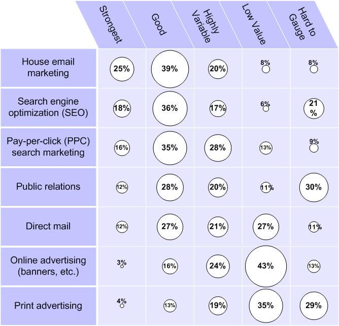
I don’t pretend to be a charting innovator, but instead present this as encouragement. If I can improve data using a simple graphics program (I used Visio), so can you.
Reminds me a bit of Topic Cloud results. Certainly conveys more info at a glance for me than the traditionally-listed numbers. Love that out-of-the-box thinking applied to something so established!
Love it! You can also try playing with font size, boldness, and color to emphasize percentage. One interesting observation I had for both charts was that nothing indicates that 100% is calculated for each row vs. the column.
I agree, Jeanette, that it does resemble the type of comparative information that a tag cloud does.
I’ve actually used variants of tag clouds to display top keywords that people are searching on to find a client’s site. It is SO much more helpful than some numbers next to a list of words. The can see in an instant the most versus the least used keywords to find their site. It makes for far more productive reporting.
Thanks, Michael. You’re right that some additional emphasis can be given. As Jennette implied with her tag cloud comparison, font size and boldness might be tried to further convey size.
You’re also right that none of them added to 100%. I recall sifting through the data with Excel to see how I could make the numbers clearer in my own head, and had to assume that incomplete reporting and double-answers for some questions had to account for the lack of tidy sums.
GitHub (source code hosting service) uses “PunchCard” graphs to show a representation of code commits by Day and Hour:
http://github.com/technoweenie/restful-authentication/graphs/punch_card
They use the GoogleCharts API to generate those – it’s a scatter plot (http://code.google.com/apis/chart/types.html#scatter_plot).
I had planned on using the concept in my golf score tracking app, but got distracted by something shiny.
I’ve seen Tufte’s work mentioned by other bloggers and authors who are exploring better ways of communicating information visually. Can you recommend a good book or essay to start off with for us newbies? Thanks!
Chris
I think I’d recommend starting with the book Envisioning Information. But beware. The book is a gateway drug to his others. And they aren’t cheap. The only mercy he shows on us is he hasn’t written too many.
I also suggest, for a little immediate gratification, his essay in Wired, Powerpoint Is Evil.
Thanks, Bryan, for the link, and the laugh (objects can be shiny, and I too am easily distracted!).
I’m a huge fan of Google’s graphing tools, especially its Motion Charting mechanism for their Spreadsheets app. When I’ve got a good example to show (not one using a client’s propriety info, that is) I’ll share it here.
Thank you for the comment, and by doing so, making the conversation more meaningful for other readers!
It’s clearly been a while since I’ve priced Tufte’s books. Chris just emailed me to say the prices are much closer to what you’d expect for a “coffee table book.” As I mentioned to her in that email, these books can’t be cheap to produce. There are tons of color illustrations, on large-format books with high-quality paper.
They’re well worth your investment if you care about visual representation of information.
THis can be done for free inside Excel and PowerPoint with BeGraphic addin.
Any data visualization (changes in size, color, angle, border…) can be done with this tool.
Many examples and videos on the website.
Regards